Art Fundamentals for Beginners
If you are completely new to art, this is a great starting point!
Forget the heavy art history for a minute, or really abstract ideas; we will be looking at the basic building blocks, the stuff that makes all art, really, from a quick sketch to a huge painting.
It's like learning the alphabet before you try to write a novel, or learning a few chords before playing a song. These are the art fundamentals that will help boost your creative output to another level.
The fundamentals are essential concepts and skills that artists learn, regardless of their style or medium. This is the starting point!
Where do we even begin? With the absolute basics! Let's start with the "ingredients," if you will: the elements of art. These are the raw materials. There are seven key ingredients.

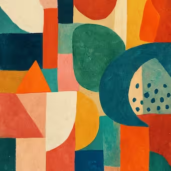
The 7 Elements of Art: The "Ingredients"
We will explore each of these seven elements in much greater detail in future articles, but for now, let's take a brief look at each one and get a basic understanding.
1. Line
A line is basically just a mark made by a tool, like a pencil or pen. But it is more versatile than it sounds!
Lines can be thick, thin, straight, curvy, zigzag, you name it.
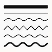
Lines can suggest things, like feelings or movement. A sharp, broken line feels very different from a long, smooth, flowing one.
One might feel energetic or angry; the other, calm. Lines do a lot of work!
Lines create edges, and edges make a shape, which leads us to the next element.
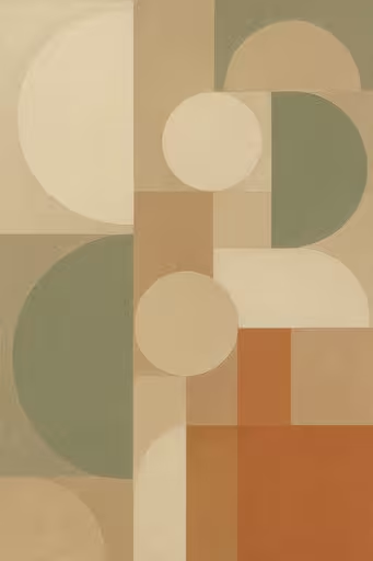
2. Shape
A shape is a two-dimensional (2D) area that is flat, with defined boundaries, like your basic circle, square, or triangle. Shapes can be geometric (like squares and circles) or organic (free-form, like a leaf).
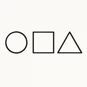
And if you give these shapes some depth, then you get form.
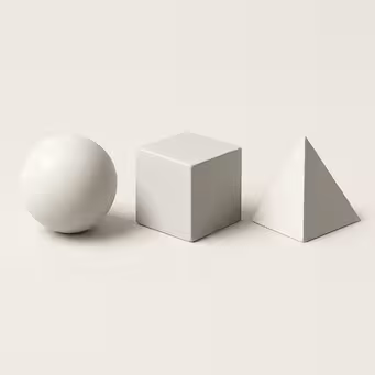
3. Form
Now we're talking three dimensions (3D), or at least the illusion of three dimensions. So, a square becomes a cube, a circle becomes a sphere, and a triangle becomes a tetrahedron or pyramid. Form is something that looks like it has volume and takes up space.
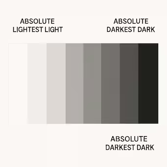
4. Value
This one is really important. It's all about lightness and darkness, how light or dark something is.
Value creates your highlights (those bright spots) and your shadows (the dark areas). It's crucial for making things look solid and real, and it really sets the mood too. You can kind of see this with the shadows in the picture above when we looked at form.
A dark, shadowy picture feels different from a bright one. There are distinct value steps in painting, from the absolute lightest light to the darkest dark. This range is often represented on a value scale.
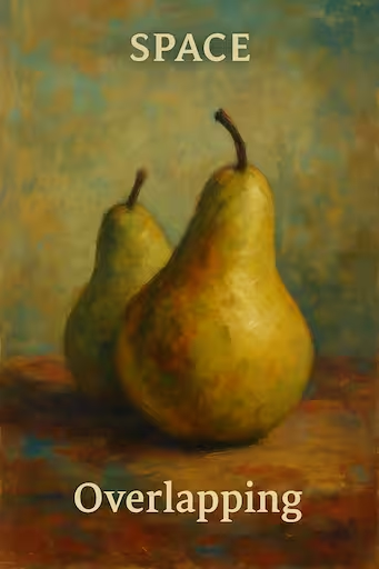
5. Space
How does space work in a flat painting? It is the area around objects, above them, between them, and even within them sometimes. Artists use various techniques to create the illusion of depth and distance on a flat surface.
Artists have all these tricks to make you feel like there is depth there, even on a flat canvas! For instance, overlapping: putting one object slightly in front of another.
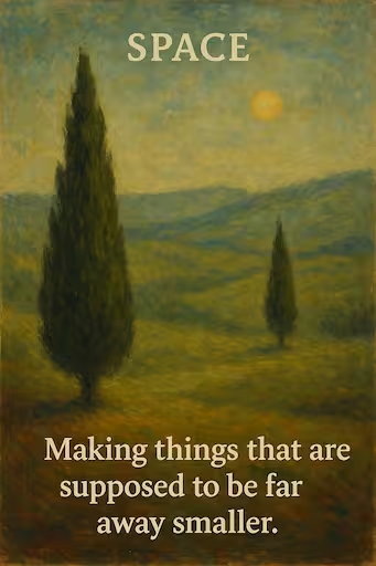
Or by making things that are supposed to be far away smaller. Placing distant things higher up on the picture plane can also suggest depth.
Putting more detail on the things close up and less detail on things far away is another technique. And even using color and value for things in the distance, often they are paler and less distinct. Like looking at mountains far away, they look kind of hazy. That is atmospheric perspective, which ties into space!

Another way to look at it is positive and negative space. Positive space is your main subject, the thing itself. Negative space is the empty area around and between your subjects. Both are super important for a good composition.
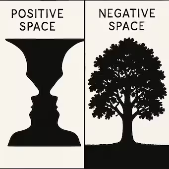
Think of a cutout shape. The shape is positive space; the background is negative space. Skilled artists consider both to create engaging compositions. For more about how backgrounds effect the visuals, check out the page about background in art.
6. Texture
Texture is about how a surface feels or, often in drawing or painting, how it *looks like* it would feel, such as rough, smooth, soft, or bumpy. Artists can create *actual texture* (which can be felt, like thick paint) or *implied texture* (which is visual and gives the illusion of texture).
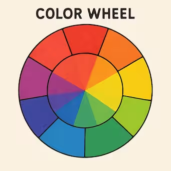
7. Color
Color is probably what most people think of first with art. Color theory is a very deep topic, but the three main aspects of color are:
- Hue: The pure color itself (red, blue, green).
- Saturation (or Intensity): How bright or dull the color is. Is it a really bright, pure red or a dull, muted red? High saturation is bright; low saturation is duller.
- Value: We've already talked about this, how light or dark the color is. So you can have a light blue and a dark blue; same hue, different value.

Primary colors mix to make secondary colors. Red, yellow, and blue are primary. Mix them, and you get orange, green, and purple, the secondary colors. Mix those again, and you get tertiary colors (red-orange, yellow-green).
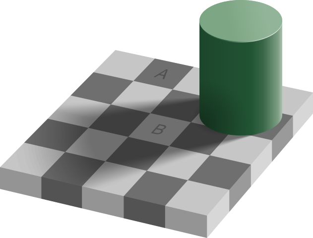
How colors look next to each other matters too. That is color context or simultaneous contrast. The same color can look totally different depending on what is around it. In the famous checker shadow illusion below, the square labeled A appears to be darker than the square labeled B, but they are actually the same color!

So those are the seven elements. If these elements are like ingredients in cooking, like flour, eggs, and sugar, you need them to make anything. But just having the ingredients doesn't guarantee a masterpiece. You need the recipe, too.
That's where the principles of design (or principles of art) come in.
The Principles of Design/Art: The "Recipe"
The principles of art are the recipe. They tell you how to organize those elements, how to use them effectively. So, principles are like the instructions that guide how you combine the elements. There are several key principles:
1. Balance
Think of balance as keeping things stable, visually stable.
It's about distributing the visual weight in the artwork so it doesn't feel like it's going to tip over. Visual weight refers to the perceived "heaviness" or "lightness" of elements.
Think of a seesaw. Big, dark objects tend to feel heavier visually than small, light ones. Bright colors can feel heavier than muted ones. Placement matters, too.
And there are different kinds of balance:
-
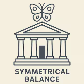
Symmetrical Balance: Both sides of a central axis are basically mirror images. Very formal, very stable. Like a portrait looking straight at you.
-
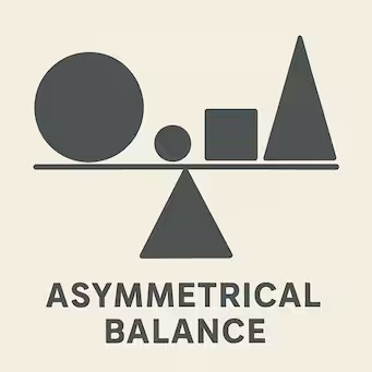
Asymmetrical Balance: The two sides are different, but they still feel balanced somehow. Maybe a large shape on one side is balanced by several smaller shapes or a smaller area of high contrast on the other. It's often more dynamic, more interesting, and less predictable.
-
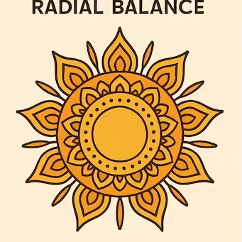
Radial Balance: Everything radiates out from a central point, like the spokes of a wheel or the petals of a daisy.
2. Emphasis (or Focal Point)
This is about creating a focal point, the main thing you want the viewer to look at first. It's the area that commands the most attention.
Artists usually achieve this through contrast, making one area bigger, or brighter in color, or having a really different texture or shape. Something that makes it stand out from everything else.
It grabs your attention, like the main character in a scene. This is how the artist guides your eye through the picture.
Using lines, the edges of shapes, or the flow of colors can create a path for your eye to follow, leading you around the composition and often towards the focal point.
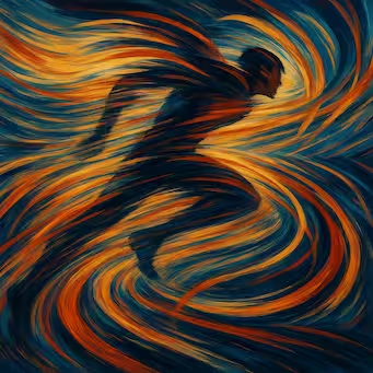
3. Movement
Movement refers to the path the viewer's eye takes through the artwork, often to focal areas. Such movement can be directed along lines, edges, shape, and color within the artwork. Artists use movement to create a sense of action or to guide the viewer's gaze. For example, diagonal lines can create a feeling of dynamism, while curving lines can create a sense of flow.
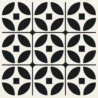
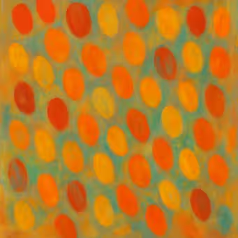
4. Pattern
Pattern is the regular repetition of an object, symbol, or element of art (like lines, shapes, or colors). It creates a sense of order and predictability. Think of polka dots, stripes, or the patterns on wallpaper.
5. Repetition
Repetition works with pattern to make the artwork seem active. The repetition of elements of design creates unity within the artwork. It can be a repetition of a shape, color, line, or any other element. While similar to pattern, repetition can be less structured and more about creating visual rhythm or reinforcing an idea.
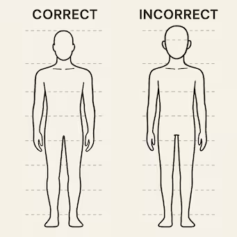
6. Proportion (or Scale)
This is about the size relationships between different parts of the artwork, or the size of one object in relation to others. Scale refers to the overall size of an object, while proportion refers to the relative size of parts within a whole.
How big one thing is compared to another. Getting proportions right helps create that sense of realism or harmony. Artists can also deliberately manipulate proportion for expressive effect (making a figure's hands overly large to emphasize labor).
Think about drawing a person. The head needs to be the right size compared to the body. The guideline of a figure being seven and a half heads tall is a classic proportion example. Getting those relationships right is key for representational art.
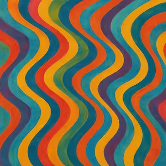
7. Rhythm
This comes from repeating elements, too, but it creates a feeling of organized movement, kind of like a beat in music or steps in a dance. Rhythm is created when one or more elements of design are used repeatedly to create a feeling of organized movement.
There are different types of rhythm: regular (predictable repetition), flowing (curved or undulating elements), and progressive (elements change in size or spacing as they repeat). Artists use repetition, but maybe with slight variations, contrasts, or gradual changes to create these different visual rhythms. That's energy or flow, visual music.
8. Unity (or Harmony)
This is the overall feeling that everything in the artwork belongs together, that it all works as a complete whole. It's about achieving harmony and completeness.
Artists might achieve unity by, say, using only a limited range of colors (a monochromatic or analogous color scheme), applying texture consistently across the piece, or repeating similar shapes. It creates that sense of oneness and visual coherence.
9. Variety (or Contrast)
While unity is important, too much unity can be boring. Variety is the use of several different elements of design to hold the viewer’s attention and to make the artwork more interesting. To learn more about contrast, check the detailed article about how contrast is used in art.
So, elements are the ingredients, and principles are the recipe for combining them.
Other Essential Foundational Skills
Composition
We touched on it with balance and space, but it's really the overall arrangement and organization of all the visual elements within the picture plane, the whole layout.
It's how you place the elements and apply the principles. Good composition structures the artwork, directs the viewer's attention, and communicates the artist's intent effectively.
A famous compositional guideline is the "rule of thirds." Imagine dividing your canvas into nine equal rectangles, like a tic-tac-toe grid.

The idea is to place important elements along those lines or where the lines intersect. It tends to create more visual interest than just centering everything.
Simplification is another good principle of composition. Don't clutter the image. Decide what's important and focus on that. Less can often be more. These fundamentals are crucial in many art forms, particularly in narrative art, where they help convey stories and emotions.
Perspective
This is a big one, especially for creating realistic art. It's all about creating that illusion of three dimensions and depth on a flat surface.
It's what makes roads look like they go off into the distance. There's linear perspective (often one-point, two-point, or three-point perspective), where parallel lines appear to converge at one or more vanishing points on the horizon line.
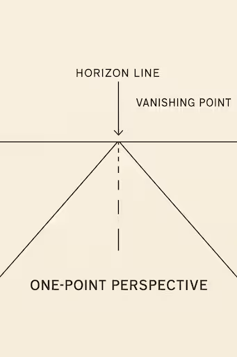
And then there's atmospheric perspective (or aerial perspective), which we mentioned with space: things further away get fuzzier, less detailed, and paler in color, often with a bluish tint.
And the core idea, really simple but vital, is that things look smaller the further away they are. Seems obvious, but you have to consciously apply it when drawing or painting.
Anatomy (for Figurative Art)
If you're interested in drawing or painting people or animals, understanding the underlying structure, bones and muscles, is fundamental. You need to know what's under the skin to create believable forms.
It helps immensely to make figures look believable and not just like floppy cartoons (unless that's your goal, of course!).
Start simple by using basic shapes (like spheres, cylinders, and cubes) to represent body parts and understanding how joints move and articulate.
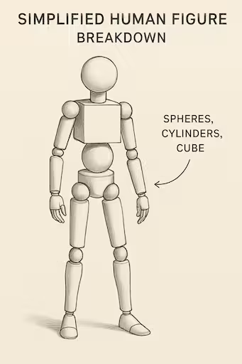
Construction Drawing
This is about building up your drawing using simple 3D shapes like cubes, spheres, cylinders, and cones as a foundation for more complex objects.
It’s like building with blocks before adding details. You map out the basic forms first, then refine them and add specific features.
It's super helpful, especially when drawing things from your imagination (not just copying), as it helps you understand the 3D structure and how objects occupy space.

Practice and Observation: The Keys to Growth
The key thing to remember, especially for beginners, is that getting the hang of this stuff takes time and consistent practice. Don't be afraid to make mistakes, they are part of the learning process!
It's better to draw 100 "wonky" or imperfect drawings than to strive for one "perfect" one when you're starting out.
Don't aim for perfection right away. Aim for mileage and experience. Just keep drawing, keep painting, keep experimenting with these elements and principles. Observe the world around you, how light falls on objects, the shapes and textures you see, the way colors interact. That's how you learn and grow as an artist.