Contrast in Art Explained
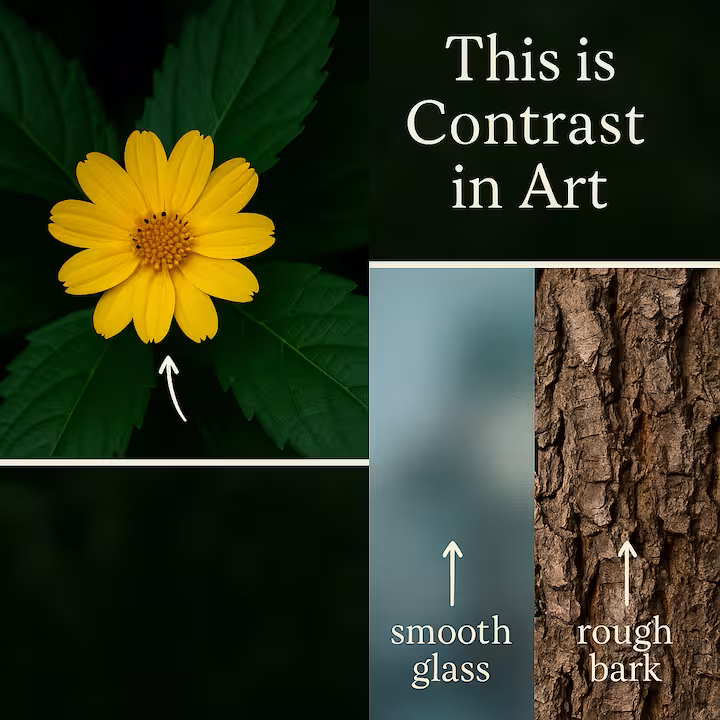
Ever wondered what makes a piece of art just pop? Or how artists guide your eye exactly where they want it to go? A big part of that magic is contrast in art. It's not just a fancy term, it's a fundamental principle that breathes life into creations, making them dynamic and engaging. Think of a bright flower standing out against dark green leaves, or the striking difference between smooth, cool glass and rough, warm wood. That's contrast at play!
At its heart, contrast is about juxtaposing opposing elements to make their differences stand out. This interplay creates visual energy and is a super powerful tool for artists. So, let's dive into the different ways artists use fundamental principles of art like contrast to grab your attention, guide your eye, and shape how you feel about their work.
Types of Contrast in Art
Contrast isn't a one-trick pony. Artists have a whole palette of contrasting elements to work with. Here are some key types you'll often see:
Value Contrast
Definition: This is all about the difference in lightness and darkness between elements, essentially, shades of gray. Think of it as the range from pure white to pitch black, and all the grays in between.
Purpose: Value contrast is crucial for creating a sense of depth and highlighting form. It helps define three-dimensional volume on a two-dimensional surface, making objects look solid and real. Artists like Caravaggio were masters of this with a technique called Chiaroscuro (Italian for "light-dark"), using strong contrasts to give figures a sculpted, dramatic appearance. An extreme form of this is Tenebrism, where forms emerge from a predominantly dark background, creating intense drama, almost like a spotlight in a dark room.
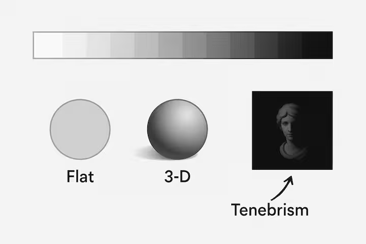
Example: The light and dark tones used in a portrait to simulate shadows on a cheekbone and highlights on the nose, making the face appear three-dimensional.
Color Contrast
Definition: This involves differences in hue (the color itself, like red vs. blue), saturation (the intensity or purity of a color, like bright red vs. dull red), or brightness/value (how light or dark a color is).
For a visual example of how contrast, brightness, and saturation affect art, check out the Live Contrast Adjuster tool. It lets you upload your own image and adjust the brightness, contrast, and saturation to see how these changes impact the look of your image in real time.
Purpose: Color contrast adds vibrancy, emphasizes focal points, and can evoke powerful emotions. For instance, warm colors (reds, oranges, yellows) often convey excitement or energy, while cool colors (blues, greens, violets) can suggest calmness or serenity. Key types of color contrast include:
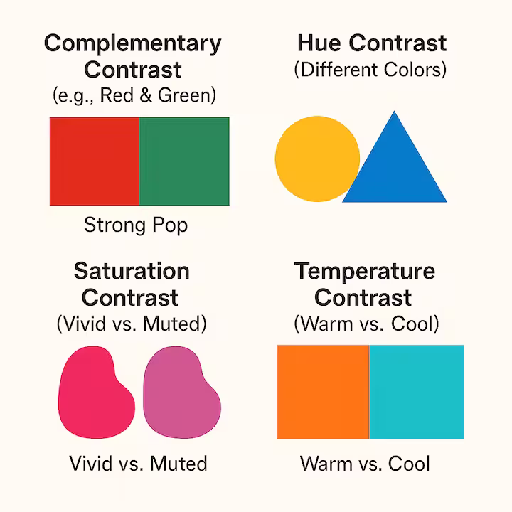
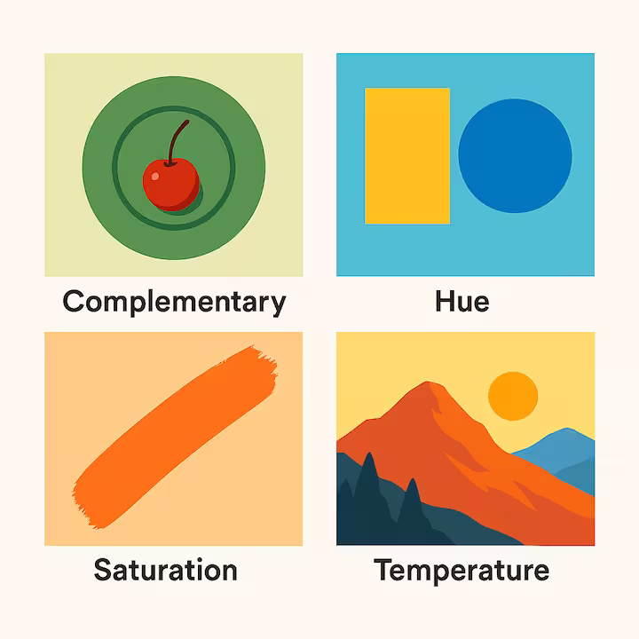
- Complementary Contrast: Colors opposite each other on the color wheel (red and green, blue and orange). They create the strongest visual pop and can make each other appear more intense.
- Hue Contrast: The difference between distinct color families (a yellow square next to a blue circle).
- Saturation Contrast: Juxtaposing vivid, pure colors with muted, desaturated ones. This can make the saturated colors really stand out.
- Temperature Contrast: Pitting warm colors against cool colors. This can create a sense of depth (warm colors often advance, cool colors recede) and emotional tension.
Example: A bright red flower standing out vividly against a muted green leafy background, drawing your eye immediately to the bloom.
Texture Contrast
Definition: This is the juxtaposition of different surface qualities, think smooth versus rough, glossy versus matte, soft versus hard, or bumpy versus flat. It appeals to our sense of touch, even when we're just looking.
Purpose: Texture contrast adds tactile interest and visual complexity. It can make an artwork more engaging and lifelike, inviting the viewer to imagine how the surfaces would feel.
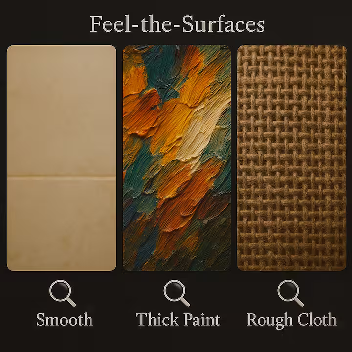
Example: A sculpture combining a smooth, polished marble figure with a rough, unhewn stone base, or a painting where thick, impasto paint strokes (rough) are contrasted with thinly painted, smooth areas.
Shape and Form Contrast
Definition: This involves combining different types of shapes or forms. Commonly, it's the contrast between geometric shapes (those with clear, defined edges and angles like squares, circles, triangles) and organic shapes (irregular, curved, flowing shapes often found in nature, like leaves or clouds).
Purpose: This type of contrast can create visual interest, tension, or harmony between elements. It helps define the character of different parts of a composition.
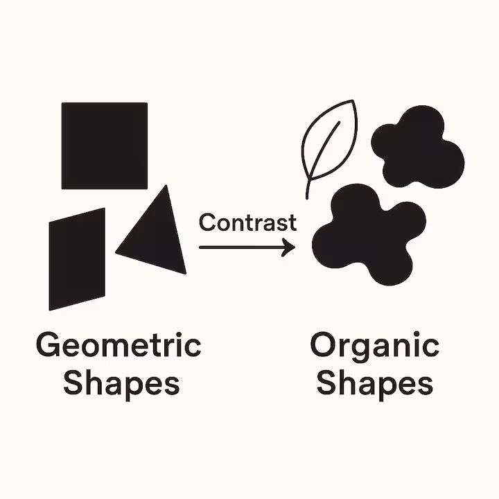
Example: M.C. Escher’s famous "Sky and Water" woodcuts, where the organic shapes of birds gradually transform into the more geometric, interlocking shapes of fish.
Size and Scale Contrast
Definition: This is about varying the physical dimensions of elements within an artwork, placing tiny objects next to colossal ones, or small details within a large expanse.
Purpose: Size and scale contrast can create dramatic impact, emphasize the importance or insignificance of elements, and play with the viewer's perception of space and reality.
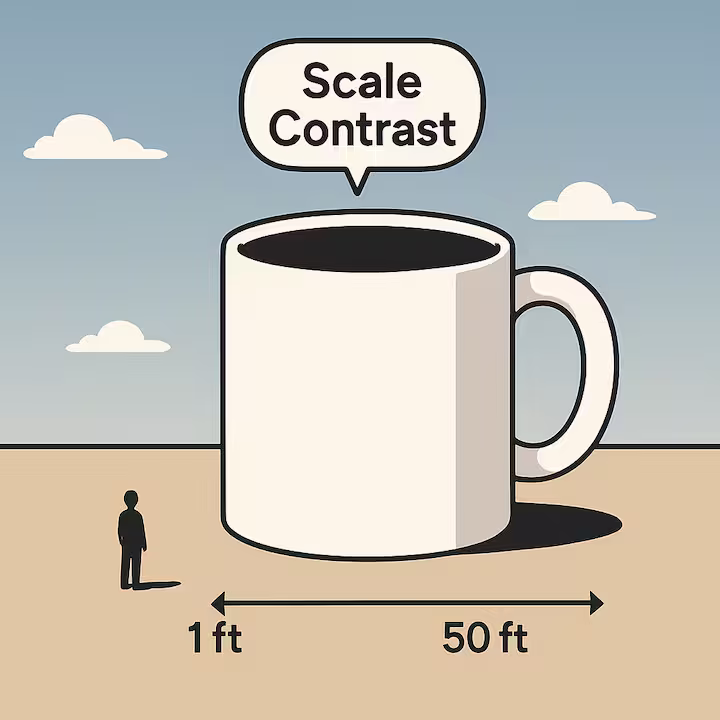
Example: Sculptures like Claes Oldenburg’s "Spoonbridge and Cherry," where an everyday object is blown up to monumental proportions, creating a surprising and whimsical effect. Or, in painting, tiny human figures dwarfed by a vast, imposing landscape to emphasize its grandeur.
Detail Contrast
Definition: This refers to the differences in the level of intricacy or simplicity within an artwork. Some areas might be packed with fine detail, while others are left more general or plain.
Purpose: Detail contrast helps highlight focal points, our eyes are naturally drawn to areas of higher detail. It can also create visual balance and prevent a piece from feeling too busy or too sparse.
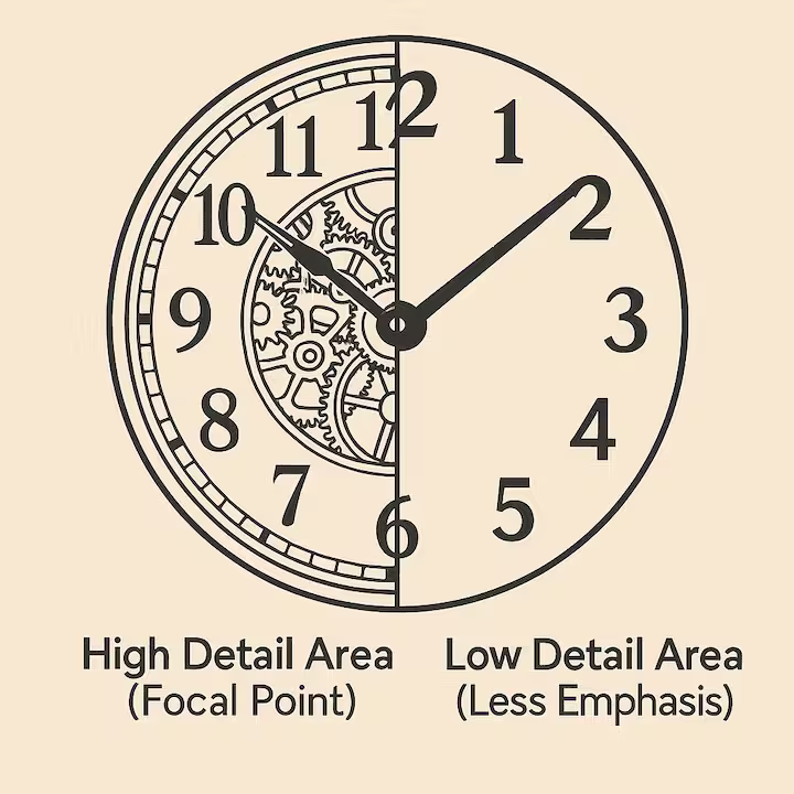
Example: A highly detailed central figure in a painting set against a minimalist or softly focused background, ensuring the viewer's attention is fixed on the main subject.
Conceptual Contrast
Definition: This type of contrast moves beyond purely visual elements to juxtapose opposing ideas, eras, themes, or subjects.
Purpose: Conceptual contrast provokes thought, creates symbolic meaning, and can challenge the viewer's perceptions or assumptions. It's about the story or message conveyed through the clashing ideas.
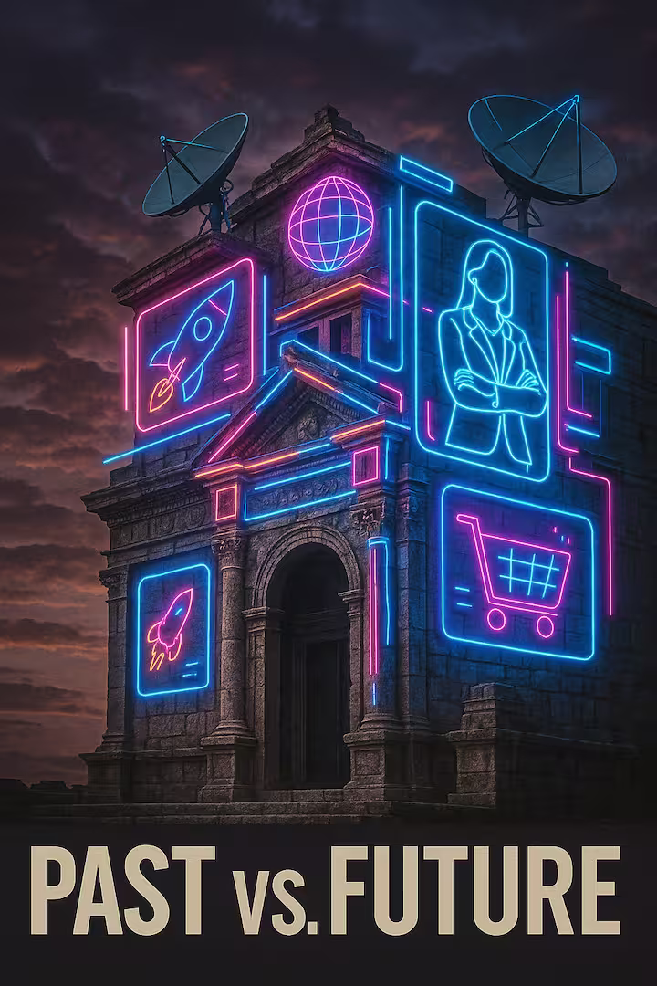
Example: An artwork depicting a historic, centuries-old building covered in modern satellite dishes, symbolizing the contrast between past and future, tradition and technology.
Key Differences: Value, Contrast, and Volume
It's easy to get these terms a bit jumbled, so let's clear them up:
- Value: This simply refers to the lightness or darkness of a color or tone. Think of it as where something falls on a scale from white to black.
- Contrast: This is the degree of difference between elements. You can have contrast in value (high contrast = big difference between light and dark, low contrast = subtle difference), but also contrast in color, texture, shape, etc. It’s the measure of that difference.
- Volume: This refers to the three-dimensional space an object occupies, its form and physical presence. In 2D art, volume is an illusion.
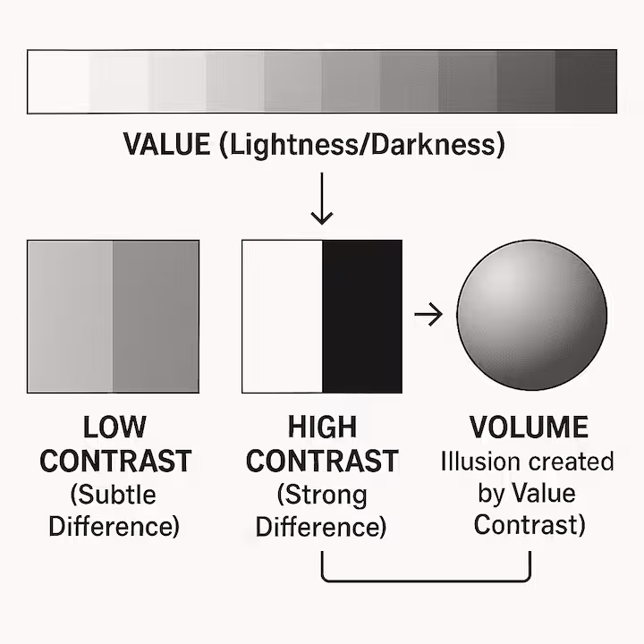
The Relationship: They're closely linked! Specifically, value contrast is a primary tool artists use to create the illusion of volume on a flat surface. By skillfully placing lights and darks (shading), an artist can make a circle look like a sphere, or a flatly drawn face appear to have depth and structure.
Purpose of Contrast in Art
So, why do artists bother with all these types of contrast? What's the big deal?
-
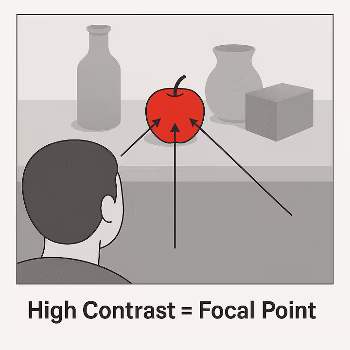
Guides Attention: High contrast areas act like magnets for our eyes. Artists deliberately use strong contrast to direct your focus to the most important parts of their work, the focal point.
- Creates Visual Interest: Let's be honest, a piece without any contrast would likely be pretty bland and monotonous. Contrast adds variety, dynamism, and excitement, keeping the viewer engaged.
- Enhances Emotion: Contrast, especially in color (like warm vs. cool) or value (dramatic light and shadow), can significantly influence the mood and emotional impact of an artwork. Think fiery reds for passion or deep shadows for mystery.
- Defines Form and Space: As we saw with value contrast, it’s essential for showing shape, depth, and how objects relate to each other in space.
- Adds Clarity or Drama: Subtle contrast (low contrast) can unify a composition and create a softer, more harmonious feel. Bold contrast, on the other hand, adds drama, impact, and clarity.
Practical Applications
Understanding contrast isn't just for art critics, it's incredibly practical:
- Artists: Obviously! They use contrast to control how viewers experience their work, to emphasize themes, convey emotions, and create compelling compositions.
- Design: Contrast is vital in all areas of design. In UI/UX design, high-contrast text and buttons ensure readability and usability. Photographers use light and shadow contrast for dramatic effect. Architects use contrasting materials or forms to make buildings more interesting.
- Everyday Life: Once you start noticing it, you'll see contrast everywhere! It helps in arranging spaces (contrasting furniture colors or textures in a room), analyzing media, or simply appreciating the visual richness of the world around you.

Tips for Effective Use of Contrast
Using contrast effectively is an art in itself. Here are a few pointers:
- Focus Strong Contrast: Use your boldest, most striking contrasts around your focal points or main centers of interest. This helps to draw the eye where you want it most.
-
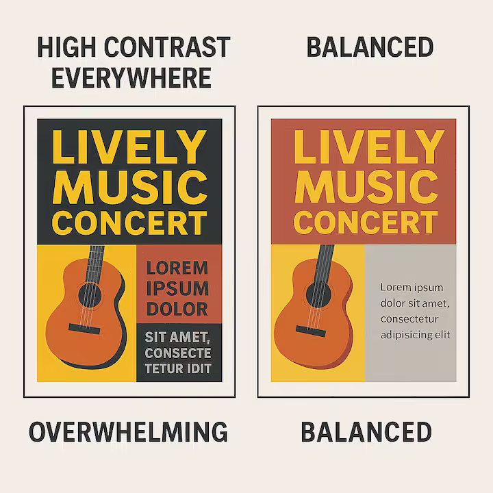
Balance Contrast: Too much high contrast everywhere can be overwhelming and chaotic. Balance it with areas of lower, more subtle contrast to give the viewer's eyes a rest and create a sense of harmony.
-
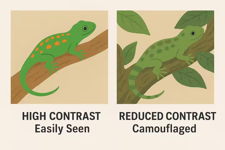
Purposeful Camouflage (Reduced Contrast): Sometimes, the goal is the opposite, to blend elements. Deliberately reducing contrast can make things recede or merge, much like camouflage in nature. This shows that controlling the *lack* of contrast can also be a purposeful artistic choice.
- Consider the Mood: High contrast often creates drama and energy, while low contrast can feel calmer or more subtle. Match your contrast levels to the emotion or atmosphere you want to convey.
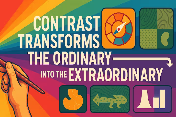
Contrast is far more than just making things black and white. It's an incredibly versatile and essential tool that shapes how we perceive and interact with visual information. From the subtle play of light and shadow that gives a sculpture its form, to the vibrant clash of colors that makes a painting sing, contrast in art is what transforms the ordinary into the extraordinary.
By understanding its diverse types and powerful applications, artists and designers can craft compelling work that engages, informs, and evokes deep emotion. And for the rest of us, a little knowledge about contrast sharpens our eye, allowing us to appreciate the visual world, from masterpieces in a gallery to the design of our favorite app, on a whole new level.
A masterful use of contrast can elevate an artwork, as seen in many historical and contemporary examples of visual storytelling.