A Friendly Guide to Color Theory
Ever wondered why a splash of yellow can make you feel cheerful, or why some color combos in a painting just sing? Or how your favorite brands use color to catch your eye? It all comes down to the amazing world of color theory!
This isn't just for art critics or fancy designers; it's something that touches everything, from the art hanging in galleries to the t-shirt you picked out this morning. It is a fundamental part of art. This guide is here to unravel the mysteries of color, making it easy to grasp, fun to learn, and super useful, whether you're dreaming of becoming an artist, a curious designer, or just someone keen to understand the vibrant world buzzing around you.
What is Color Theory, Anyway?
Color is a huge part of our everyday lives. It subtly (and sometimes not-so-subtly!) influences how we see things, what we feel, and how we interact with the world. Getting a grip on the basic ideas behind color can give you a superpower: the ability to use color more effectively and truly appreciate its impact.
So, What's Color Theory, Really?
Simply put, color theory is a mix of art and science that helps us understand how colors work together, how our eyes and brains perceive them, and how they can stir up emotions or guide our actions.1 Think of it as a friendly guidebook or a super-versatile toolbox for anyone who plays with color.
Understanding how colors can symbolize ideas or evoke specific emotions is key for artists, particularly those working in narrative genres where storytelling is paramount.
That includes artists trying to set a certain mood, designers aiming for an unforgettable brand, or even you, choosing an outfit that shouts "this is me!" It gives us a solid foundation for making smart, intentional color choices, moving beyond just a gut feeling to making decisions with confidence.
As a field, it "encompasses the art and science of using color and helps us understand how we perceive and react to color".1 It's there to give a helping hand, guiding creators to "choose the right colors for their projects".2
And guess what? The principles of color theory aren't just for the pros. We all use them, whether we realize it or not, because color itself is a powerful, silent language that shapes our world.
Why Color Matters: From Masterpieces to Your Morning Coffee Cup
Color is literally everywhere, and its influence is massive. It can grab our attention, bring up specific feelings, communicate complex ideas without a single word, and sway our emotions in ways both big and small.1 In visual communication, color is essential, a red stop sign instantly screams "danger, halt!", while the specific blue of a social media app can become a symbol of connection. The emotional punch is just as real, a room painted in soft, cool blues can feel like a calm oasis, while a bright yellow space might buzz with energy and cheer.
In art, color is a star player, used to convey mood, create depth, and give works hidden symbolic meanings. For designers, understanding color is key for branding that sticks, making apps easy to use, and creating products people love. Even in nature, color has vital jobs, from flowers using flashy hues to attract bees, to animals sporting bold patterns as a warning. So, color isn't just about looking pretty, it's about function, communication, and even our psychological well-being. When designers pick colors, they're aiming to "optimize the visual and emotional impact of designs on the user" 2, showing just how much color contributes to making things usable and enjoyable.
A Quick Peek: How We Actually See Color
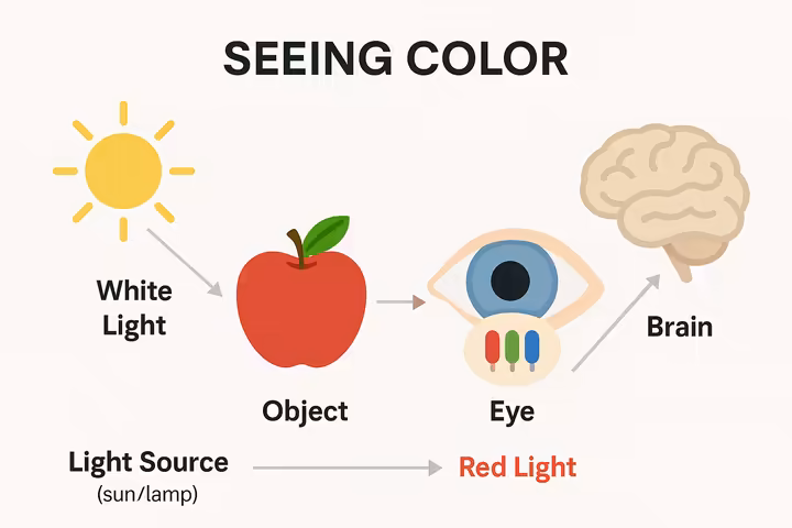
The "magic" of seeing color all starts with light. What we think of as white light, like sunlight, is actually a vibrant mix of all the colors of the rainbow, each traveling at a slightly different wavelength.3 When light from a source (like the sun or your desk lamp) hits an object, the object's surface soaks up some of these wavelengths and bounces others back. The wavelengths that get reflected are what travel to our eyes, and voilà, that's the color we see!3
This reflected light zips into our eye and heads to the retina, a light-sensitive layer at the very back.3 The retina is packed with millions of tiny photoreceptor cells: rods, which are great for seeing in dim light (think black and white), and cones, which are the heroes of color vision.3 Most of us have three types of cone cells, each mostly tuned into different wavelengths of light (roughly red, green, and blue). When light hits these cones, they send little electrical messages through the optic nerve straight to the brain.3 The brain then acts like a super-smart decoder, figuring out the mix of wavelengths to create the perception of a specific color.3 So, a red apple looks red because its surface absorbs most light wavelengths except for the ones we see as red, which bounce right into our eyes.
This whole process shows something really important: color isn't a fixed, built-in quality of an object. It's actually a perception our visual system creates by interacting with light and how an object's surface behaves.2 This helps explain why how we see color can be a bit subjective, varying from person to person or even changing under different lights.
The Language of Color: Basic Terms to Get You Started
To talk confidently about color, it helps to know a few basic terms. These are the building blocks for understanding how colors relate to each other and how we can tweak them.
| Term | Simple Definition | Think of it as... (Analogy/Example) |
| Hue | The pure name of a color, its basic identity on the color wheel.2 | Red, blue, green, yellow, the color's family name. |
| Value | How light or dark a color is, on a scale from black to white.1 | A light sky blue (high value) vs. a dark navy blue (low value). |
| Saturation (Chroma/ Intensity) | The purity or vividness of a color, how bright or dull it appears.1 | A super vibrant, pure red vs. a muted, grayish pink. Like turning up the color intensity on a TV. |
| Temperature | Whether a color feels "warm" or "cool" to us.1 | Reds and yellows feel warm (like sunshine), blues and greens feel cool (like a shady forest). |
| Tint | A hue with white added, making it lighter.6 | Red + White = Pink. Think pastel shades. |
| Tone | A hue with grey added, making it less intense or duller.6 | Red + Grey = Dusty Rose. Often more muted and sophisticated. |
| Shade | A hue with black added, making it darker.6 | Red + Black = Maroon or Burgundy. Deeper, richer versions of a color. |
Table 1: Basic Color Terminology. A quick cheat sheet for essential color words.
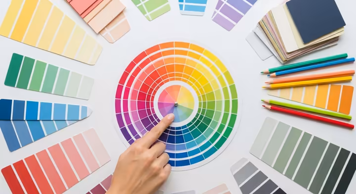
The Color Wheel: Your Trusty Map to Color Relationships
At the very heart of color theory, you'll find the color wheel. It's a simple yet incredibly powerful tool that neatly organizes colors to show how they relate to each other. Think of it as an indispensable guide for artists, designers, or anyone trying to make sense of the world of color.
The Color Wheel's Foundation: Structure and Purpose

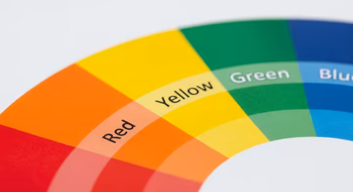
A color wheel is essentially an "abstract illustrative organization of color hues around a circle, which shows the relationships between primary colors, secondary colors, tertiary colors etc.".8 Imagine it as a friendly map of the color universe. By arranging colors in a specific, logical order, the wheel helps us see how they're made and how we can combine them to get the effects we want. Its structure is the bedrock for understanding how to create color palettes that look harmonious and visually appealing. A typical color wheel used by artists and designers is made up of 12 distinct hues.
The Foundation: Primary Colors (RYB)
When we're talking about pigments (like in paints), the traditional primary colors are Red, Yellow, and Blue (RYB). They're called primary because they "cannot be created by mixing other hues".1 They are the true originals, the foundational building blocks from which a whole spectrum of other colors can be mixed when you're working with traditional art supplies.1
Mixing It Up: Secondary Colors
When you take two primary colors and mix them together in roughly equal amounts, you create secondary colors.1 There are three of them:
- Red + Yellow = Orange
- Yellow + Blue = Green
- Blue + Red = Purple (or Violet)
These secondary colors sit cozily between the primary colors on the color wheel, expanding our palette and forming the next layer of color connections.8
Going Further: Tertiary Colors
Ready for the next step? Tertiary colors are what you get when you mix a primary color with an adjacent secondary color.1 This gives us six more nuanced hues that fill in the gaps on our color wheel:
- Red + Orange = Red-Orange
- Yellow + Orange = Yellow-Orange
- Yellow + Green = Yellow-Green
- Blue + Green = Blue-Green
- Blue + Purple = Blue-Violet
- Red + Purple = Red-Violet
These colors add even more subtlety and richness to the spectrum that artists and designers have at their fingertips.5
The Color Wheel in Practice: A Creative Tool
The color wheel is so much more than just a static diagram, it's an interactive and essential tool for anyone exploring creativity or solving visual problems.12 Artists and designers use it constantly to:
- Find Harmonious Color Combinations: The wheel visually points the way to colors that play well together, like neighbors (analogous colors) or total opposites (complementary colors). 1
- Dream Up New Color Palettes: It lets you explore different color relationships to develop unique palettes that can set a specific mood or theme. 12
- Mix Colors More Accurately: By understanding how primary, secondary, and tertiary colors connect, artists can better predict what will happen when they mix pigments, avoiding those dreaded muddy or unexpected results. 12
- Amplify Emotions: Colors have psychological superpowers, and the wheel helps pick combinations that can crank up the desired emotional volume of a piece, whether it's excitement, calm, or tension. 10
- Balance Light, Dark, Warm, and Cool: The wheel can help create visual balance by strategically using colors with different lightness levels (values) and temperatures (warm/cool). 12
Basically, the color wheel helps artists and designers to "quickly identify which colors can be mixed and which colors look best when used together in art and design".10 This active partnership makes it a dynamic sidekick in the creative process.
Evolution of the Wheel: Traditional vs. Modern
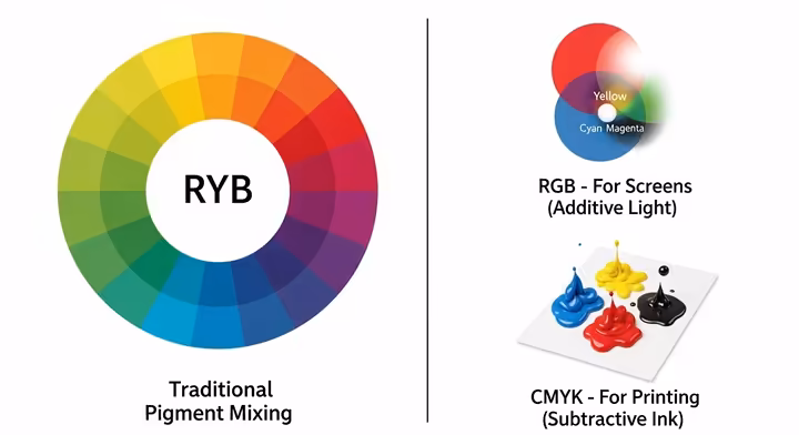
The RYB (Red, Yellow, Blue) color wheel, which we've mostly been chatting about, is the classic model for mixing pigments and is still a staple in art education.8 But, just like everything else, our understanding of color has grown, especially with all the cool new tech we have.
Modern color theory now recognizes that different sets of primary colors work best in different situations.13
- The RGB (Red, Green, Blue) model is what's called an additive system. It's used for anything that creates color with light, like your computer monitor, TV, and smartphone screen. In this system, red, green, and blue light combine to create a whole spectrum of colors. Crank all three up to full intensity, and you get pure white light! 10
- The CMYK (Cyan, Magenta, Yellow, Key/Black) model is a subtractive system, the workhorse of the printing world. Cyan, magenta, and yellow pigments are used to subtract (or absorb) certain wavelengths from white light (which is reflected from the paper). Black (K) is added to give prints real depth and true black tones.8 Modern science has actually shown that CMY are a more efficient gang of subtractive primaries for getting a wider range of super-vibrant colors in print compared to the old RYB.8
This journey from a single traditional wheel to multiple modern ones mirrors a bigger pattern we see in many fields: moving from knowledge based on experience and observation towards models that are more scientifically grounded and tailored to specific needs, all thanks to technological leaps and a deeper dive into the physics and perception behind it all.
Basics of Color: Hue, Saturation, and Value
Beyond just their spot on the color wheel, every color has distinct characteristics that define how it looks and feels. These fundamental properties, hue, saturation, and value, are like a color's DNA. Nailing these down is key to becoming a color wizard.
Hue: The Color's Basic Name
Hue is the most basic quality of a color, it's essentially the color's family name, what we mean when we say "red," "blue," or "green."2 It's the pure, unadulterated spectral color, without any white, black, or grey mixed in. The different hues are what you see arranged neatly around the color wheel. For instance, sky blue and navy blue both share the same hue (blue), even though they look different in other ways. Hue is always your starting point for describing and identifying any color.5
Saturation (or Chroma): The Color's Purity
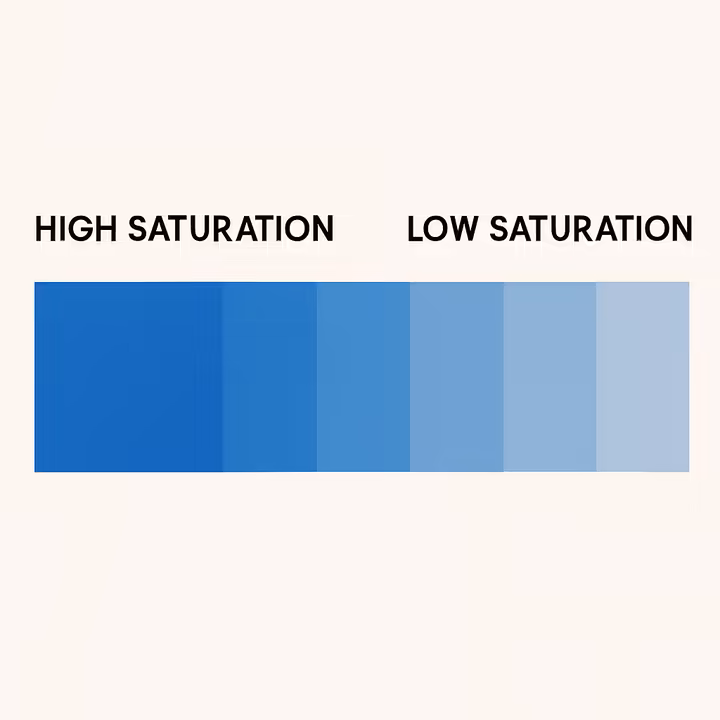
Saturation, sometimes called chroma or intensity, tells you how pure or vivid a color is.1 Think of it as a slider, going from an incredibly pure, vibrant version of the hue at one end, to a dull, muted, or grayish version at the other.1 A highly saturated color is strong, bold, and pops right out at you, while a desaturated color is more subdued, subtle, and gentle. For example, a fire engine red is screaming with saturation, whereas a dusty rose is a desaturated red (a pink that's also had some grey added to it). Saturation massively affects a color's visual punch and the mood it sets, a super-saturated yellow might feel energetic and bright, while a desaturated, pale yellow could seem soft and calming.1
Value (or Lightness/Brightness): The Color's Lightness or Darkness
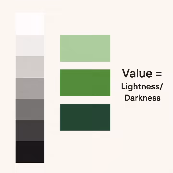
Value, also known as brightness or lightness, is all about how light or dark a color appears.1 It's a scale that stretches from pure white (the highest, lightest value) to pure black (the lowest, darkest value), with all sorts of greys in between.1 Crucially, value is a separate thing from hue and saturation. For example, yellow is naturally lighter in value than a pure blue, but you can still have a light yellow (high value) and a dark yellow (low value, like mustard), or a light blue (think sky blue) and a dark blue (like navy). Value is super important for creating contrast, defining shapes, giving a sense of depth, and making sure things are easy to read in any visual design.
The unique "feel" or personality of any color doesn't come from just one of these properties on its own. It’s born from the fascinating dance between its hue, saturation, and value. Change one, and you can dramatically alter the color's whole vibe, even if the others stay the same. For instance, a highly saturated, dark red (like a rich burgundy) feels completely different from a desaturated, light red (like a pale pink). Artists and designers are masters at playing with these interactions to get specific effects, like using high saturation for things in the foreground and lower saturation for the background to create a sense of distance.16 This dynamic interplay also really depends on the context, the colors surrounding it can further tweak how we perceive its attributes.17
Digital Color Speak: HSL, HSV, and HSB Explained
When you're tinkering with colors in digital graphics software, you'll often bump into color models like HSB (Hue, Saturation, Brightness), HSL (Hue, Saturation, Lightness), and HSV (Hue, Saturation, Value).18 Don't let the alphabet soup scare you! These are basically just different ways of describing the RGB color model, but they're designed to be more intuitive, matching up more closely with how we humans actually see and talk about color.18
So, instead of having to guess the right amounts of Red, Green, and Blue light, these models let you define colors using those three perceptual dimensions we just talked about:
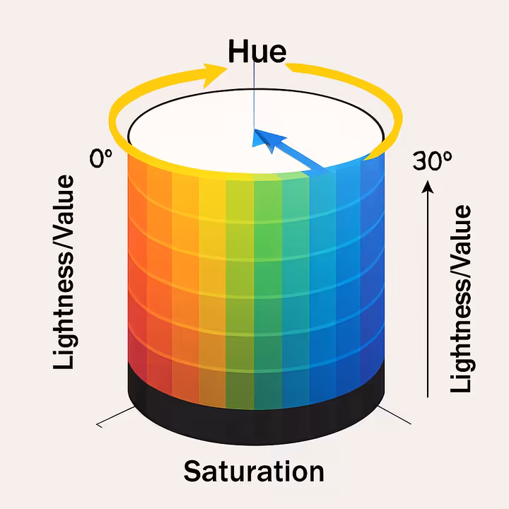
- Hue (H): This is the pure color itself, often shown as an angle from 0 to 360 degrees on a sort of color cylinder (e.g., 0° for red, 120° for green, 240° for blue). 19
- Saturation (S): This is the color's intensity or purity, usually a percentage from 0% (completely grey) to 100% (fully saturated and vibrant). 19 Think of it as how far the color is from the center of that cylinder.
- Lightness (L) / Value (V) / Brightness (B): This tells you how light or dark the color is, also often a percentage from 0% (black) to 100% (white). 19 This is like its position up or down the central axis of the cylinder.
Why bother with these? Well, directly fiddling with RGB values can feel a bit like guesswork if you're trying to make specific visual changes. For example, if you want to make a red a tiny bit lighter, it's much more natural to think "increase its lightness" than to figure out the exact tweaks to the R, G, and B numbers. HSL, HSV, and HSB systems try to bridge that gap between the techy way computers handle color and how we actually experience it, a nice user-friendly touch in digital color tools.18
Adding Nuance: Tints, Tones, and Shades
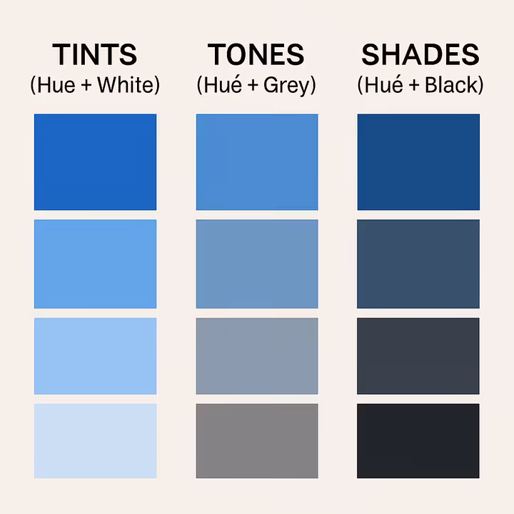
Pure hues are just the beginning of the fun! Artists and designers are always tweaking them to create a richer, more expressive range of colors. Three classic ways to modify a hue are by creating tints, tones, and shades 6:
- Tint: This is what you get when you mix a hue with white . Adding white increases the value (lightness) of the color, making it paler. For example, adding white to red gives you pink. 6
- Tone: A hue mixed with grey (which is itself a mix of black and white). This dials down the saturation or intensity of the color, making it appear duller or more muted. If you use a mid-value grey, it won't necessarily make the color much lighter or darker.6 Adding grey to red results in a desaturated, often softer, more complex red.
- Shade: This is a hue mixed with black . Adding black decreases the value (lightness) of the color, making it darker. For instance, adding black to red creates deep colors like maroon or burgundy. 6
Understanding tints, tones, and shades is a game-changer for expanding your color palette and setting specific moods. A palette full of tints might feel light, airy, and delicate, while a palette heavy on shades could seem more somber, dramatic, and mysterious.
The Trio in Action: How Hue, Saturation, and Value Interact
As we've touched on, hue, saturation, and value aren't solo acts, their interaction is what truly defines a color's overall look and emotional impact.17 A light, desaturated blue (a tint with low saturation) feels very different, perhaps calm, dreamy, and ethereal, than a dark, highly saturated blue (a shade with high saturation), which might come across as deep, powerful, and intense. Artists are constantly playing with these properties. For example, in landscape painting, distant mountains or trees are often painted with lower saturation and lighter values to create what's called atmospheric perspective, making them look further away. Foreground elements, on the other hand, might use higher saturation and stronger value contrasts to make them pop forward.16 The way these three properties combine is fundamental to how a color "feels" and what job it does in a composition.
Warm vs. Cool: The Temperature of Color
One of the most basic ways we react to and categorize colors is by their perceived temperature. Generally, colors are split into two big groups 1:
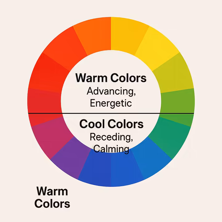
- Warm Colors: These are your reds, oranges, yellows, and all their variations. They're often linked to things like sunlight, fire, and heat. Psychologically, warm colors tend to be stimulating, energetic, and great at grabbing attention. They can stir up feelings of excitement, passion, happiness, and comfort.1 In terms of how they look in a picture, warm colors often seem to advance or pop forward.
- Cool Colors: This group includes blues, greens, purples, and their variations. They make us think of water, sky, forests, and cool shade. Psychologically, cool colors are generally seen as calming, soothing, and relaxing. They can bring on feelings of peace, serenity, stability, and sometimes a touch of sadness or formality.1 Spatially, cool colors tend to recede or look like they're further away.
While this warm/cool split is a handy starting point, it's not set in stone. The "temperature" of a color can actually be nudged by its undertones.22 For instance, a blue with a hint of yellow in it (making it a slightly greenish-blue or teal) might feel a bit warmer than a pure, icy blue. Similarly, a red with blue undertones (like some magentas) can feel cooler than a fiery, orangey-red. This more nuanced understanding allows designers to create really sophisticated palettes that play with these subtle temperature shifts to achieve complex emotional and spatial effects, moving way beyond a simple warm-or-cool choice.
Creating Perfect Palettes: Color Harmonies
Ever wondered why some color combinations just look *right* together, creating a sense of calm or excitement, while others feel a bit chaotic or off? The secret often lies in color harmony. This is the art and science of combining colors in a way that's pleasing to the eye, creating a feeling of order, balance, and visual satisfaction.23 And our trusty color wheel? It’s the main tool for figuring out and creating these harmonious relationships.1 Think of these established schemes as tried-and-true "recipes" for beautiful color palettes.
Let's explore some of the most common and effective color harmonies:
Monochromatic: The Power of One Hue
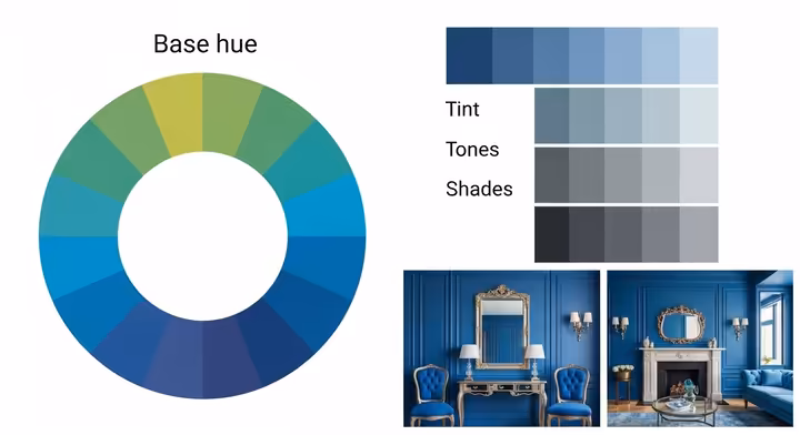
- What it is: A monochromatic scheme uses different variations, tints (add white), tones (add grey), and shades (add black), all based on a single hue.1 So, you might have a palette of light blue, medium blue, and dark navy blue.
- The Vibe: This harmony is naturally unified and often looks very sophisticated and elegant. It tends to be calming, serene, and creates a clean, simple look.24 Because it sticks to just one hue, it's often considered the easiest harmony to get right.24 The mood can range from soft and subtle (if you use mostly tints and tones) to bold and dramatic (if you bring in strong contrasts between light and dark values).
- Think of: An interior designed entirely in various shades of blue, from pale sky blue to deep navy25, a sleek brand logo that uses only different shades of grey, a classic black and white photograph (which is essentially a value-based monochromatic scheme). In nature, imagine the layered blues and greys of a misty mountain range.
Analogous: Friendly Neighbors on the Wheel

- What it is: An analogous color scheme uses two to five colors that sit right next to each other on the color wheel.1 Usually, one color takes the lead as the dominant hue, while the others play supporting or accent roles.26
- The Vibe: These schemes feel naturally harmonious and are often found in nature, creating a sense of comfort, calm, and stability.24 The visual effect is usually quite gentle with low contrast, leading to a serene and pleasing feel.27 The mood can be energetic if you pick warm analogous colors (like reds, oranges, and yellows together), or more tranquil if you go for cool analogous colors (like blues, greens, and violets).26
- Think of:
- Art: Vincent van Gogh's "Sunflowers" series is a classic, mostly using yellows and yellow-oranges. Camille Pissarro's "Sunset" beautifully captures the flow of warm analogous colors.26
- Design: Remember the original Instagram logo? Its gradient flowed through an analogous range from purple through pink to orange.27
- Nature: A sunset gently shifting from yellow to orange to red26, autumn leaves showing off a whole range of reds, oranges, and yellows, the many varied greens you’d see in a lush forest.27
Complementary: Opposites Attract with a Bang!
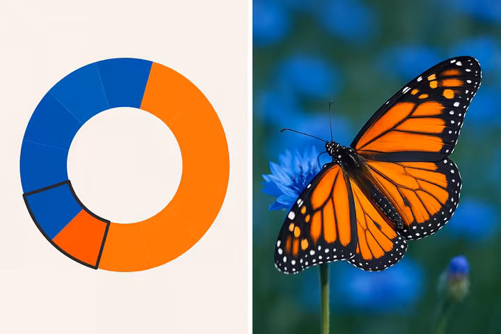
- What it is: Complementary colors are two hues that sit directly opposite each other on the color wheel.1 Classic dynamic duos include Red/Green, Blue/Orange, and Yellow/Purple.
- The Vibe: This scheme creates the highest possible contrast, making colors look even brighter and more vibrant when they're placed side-by-side.28 The effect is dynamic, energetic, bold, and definitely attention-grabbing!24 However, because the contrast is so strong, it can sometimes feel a bit jarring or overwhelming if not handled carefully, making it one of the trickier harmonies to use well.1
- Think of:
- Art/Culture: Christmas decorations are famous for their red and green complementary pairing.
- Design: Many sports team logos use complementary colors for a bold, high-impact look (think the blue and orange of the Denver Broncos or New York Knicks).
- Nature: A bright red cardinal perched among green leaves, a vivid orange sunset blazing over a deep blue ocean.28
Split-Complementary: A Softer, More Versatile Contrast
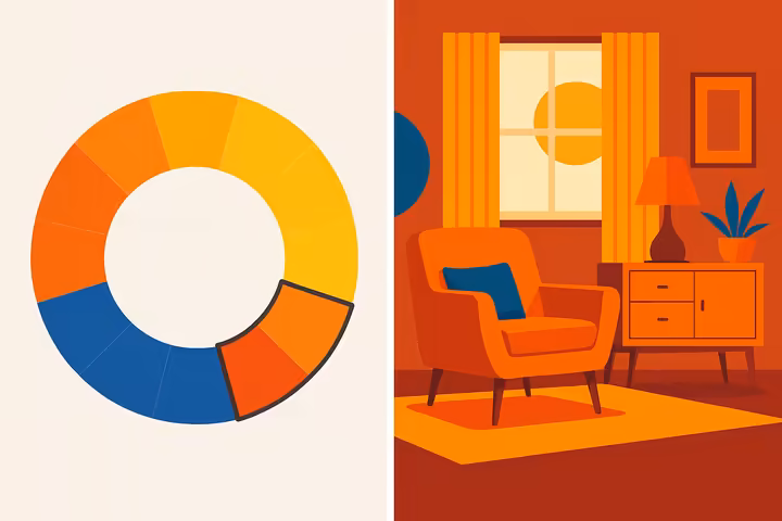
- What it is: A split-complementary scheme takes a base color and then pairs it with the two colors that sit right next to its direct complement on the color wheel.1 For example, if your base color is blue, its complement is orange. The split-complementary buddies would be blue, along with yellow-orange and red-orange.
- The Vibe: This harmony gives you strong visual contrast, similar to a complementary scheme, but with less tension and harshness.24 It's generally considered more versatile and easier to balance, providing a look that's vibrant and eye-catching without being too aggressive or in-your-face.24
- Think of: If yellow-green is your main star, its split complements would be violet and red.29 This scheme is a favorite in interior design for creating spaces that feel lively yet inviting.29 In branding, a logo might use a blue-green as its base, with pops of yellow-orange and red-violet for a dynamic but still sophisticated feel.29
Triadic: A Balanced and Vibrant Trio
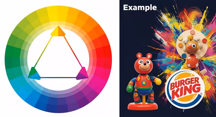
- What it is: A triadic color scheme uses three colors that are evenly spaced around the color wheel, forming a perfect equilateral triangle.10 Common examples include the primary colors (Red, Yellow, Blue) or the secondary colors (Green, Orange, Purple).
- The Vibe: Triadic schemes are often vibrant, dynamic, and full of energy, yet they maintain a good sense of balance and harmony because the hues are evenly spaced.30 They offer strong visual contrast while still feeling cohesive. The overall mood can be tweaked by letting one color dominate and using the others as accents, or by playing with the saturation and value of the colors.
- Think of:
- Design: Children's toys and play areas often use primary triadic schemes (red, yellow, blue) to create a bright, fun, and stimulating environment.
- Branding: The Burger King logo has historically used a red, yellow, and blue triad.30
Tetradic (Square and Rectangular): Rich, Diverse, and a Bit Complex
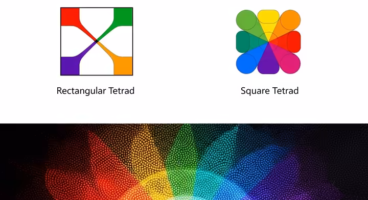
- What it is: Tetradic schemes are ambitious, they use four colors arranged into two complementary pairs. There are two main types:
- Rectangular Tetrad: Here, the four colors form a rectangle on the color wheel. This means one pair of complements will be closer together (maybe one color apart) than the other pair.32 For example, you might have purple and yellow-green (complements) paired with blue-green and red (another set of complements, where purple and blue-green are analogous, while yellow-green and red are further apart).33
- Square Tetrad: In this version, the four colors form a square on the color wheel, meaning all four colors are evenly spaced (two colors apart from each other).33 An example could be orange, yellow-green, blue, and violet.33
- The Vibe: Tetradic schemes offer the most color variety and can be incredibly rich, vibrant, and dynamic.24 However, because you're juggling four distinct hues, they can easily become overwhelming or feel chaotic if not managed very carefully.32 It's generally best to let one color be the star and use the others as accents. Also, pay close attention to the balance between warm and cool colors within your palette.32
- Think of:
- Design: User interfaces that need multiple distinct color codes for different functions (like the Google logo with its red, yellow, green, and blue, or the Microsoft Windows logo) often draw on tetradic principles.32 Complex signage or transit maps can also benefit from such schemes.24
- Nature Photography: Photographer Alain Briot provides examples like his "Route 66 Dinosaurs" (illustrating a rectangular tetradic harmony) and "Snake" (showing a square harmony).33
It's good to remember that the "rules" of color harmony are more like friendly guidelines than strict laws. They give you a great starting point, empowering your creativity rather than boxing it in. The real art comes in how you adapt and personalize these foundational schemes. For instance, that common tip to use a dominant color with secondary and accent colors in specific ratios (like the 60-30-10 rule you hear about in interior and graphic design 34), or to tweak the saturation and value of colors within a scheme 24, shows that these harmonies are meant to be fine-tuned. A complementary scheme, often called "difficult" 1, can become manageable and even sophisticated if you reduce the intensity of one or both colors, or if you use them in unequal amounts. This suggests that the trickiness of a harmony often relates to its built-in level of contrast, schemes with lower natural contrast, like monochromatic or analogous, are usually more forgiving for beginners because they naturally lean towards a pleasing result with less fiddling.
Your Turn: Crafting Palettes That Sing
Knowing the types of color harmonies is step one, using them effectively is the exciting next part. Here are some general principles to help you create color combinations that are pleasing and make an impact:
- Pick a Star Color: In most schemes (especially those with three or more colors), it's smart to let one color take the lead. This dominant color will set the overall mood. Other colors can then act as secondary (supporting) and accent (highlighting) hues.24 A popular guideline is the 60-30-10 rule: 60% for your dominant color, 30% for your secondary color, and 10% for your accent color.34 This creates a clear visual hierarchy and stops the palette from feeling like a free-for-all.
- Play with Saturation and Value: Not every color in your palette needs to be at its loudest and boldest. Using tints, tones, and shades of your chosen hues adds depth, subtlety, and sophistication.24 For high-contrast schemes like complementary, muting one or both colors can make the combination much easier on the eyes and less aggressive.24
- Consider the Mood You're After: Think about the feeling you want to create. Low-contrast schemes like analogous or monochromatic tend to be calming and serene. High-contrast schemes like complementary or triadic are more energetic and attention-grabbing.24
- Context is Everything: The "best" color scheme always depends on the specific project, who it's for, and the emotional vibe you're aiming for. What works for a children's toy brand will be very different from what's right for a financial institution's website.
- Don't Be Afraid to Experiment: Use these harmonies as starting points, not strict rules. Tools like online color palette generators can be fantastic for quickly visualizing combinations and sparking ideas.
| Harmony Name | No. of Colors & Arrangement on Wheel | Typical Mood/Effect | Pro Tip for Use |
| Monochromatic | One hue, with its tints, tones, and shades | Simple, clean, elegant, unified, calm, serene, reliable | Make sure there's enough value contrast to avoid it looking flat.24 |
| Analogous | 2-5 adjacent colors | Harmonious, calm, stable, natural, comfortable | Choose one dominant color, great for low-contrast, nature-inspired themes.24 |
| Complementary | Two colors directly opposite | High contrast, vibrant, dynamic, energetic, attention-grabbing, can be intense! | Balance the intensity, try using one color more dominantly than the other.24 |
| Split-Complementary | Base color + two colors adjacent to its complement | Vibrant contrast but with less tension than complementary, versatile, balanced | A good choice for beginners wanting contrast without it being too aggressive.24 |
| Triadic | Three colors evenly spaced (equilateral triangle) | Vibrant, dynamic, energetic, yet balanced and harmonious | Let one color take the lead, adjust saturation/value for softer effects.24 |
| Tetradic (Rectangular) | Four colors (two complementary pairs, forming a rectangle) | Rich, diverse, vibrant, can be complex to balance well | Let one color dominate, carefully balance warm and cool colors.32 |
| Tetradic (Square) | Four colors evenly spaced (two complementary pairs, forming a square) | Very colorful, high energy, can be 'in your face' if not managed | Best with one dominant color and others as accents in smaller amounts.33 |
Table 2: Color Harmonies at a Glance. A quick summary of common color harmonies and their vibes.
More Than Meets the Eye: Color Psychology & Symbolism
Colors do more than just look pretty, they talk to us on a deeper, often subconscious level. Color psychology is the fascinating study of how different colors affect our mood, emotions, and even our behavior.37 It explores how color can signal us to take action, influence our state of mind, and sometimes even trigger physical responses, like your heart beating a bit faster when you see the color red.37 Understanding this is gold in fields ranging from art and design to marketing and even therapy.
The Emotional Power of Color
The link between color and emotion is incredibly powerful and has many layers. From when we're tiny, we start building associations with colors based on our surroundings, the stories we hear in our culture, and our own personal experiences.41 These learned connections, possibly mixed with some built-in responses to certain light wavelengths, mean that "color shapes our emotions and decisions more than we realize".40 For example, some research has shown that seeing the color red before a test can sometimes make performance dip, possibly because red ink is traditionally used for marking errors, creating a link with mistakes.41 The four main psychological colors, red, blue, yellow, and green, are often pointed to for their distinct effects: red for energy, blue for calm, yellow for positivity, and green for balance.42
Warm, Cool, and How They Make Us Feel
As we chatted about earlier, colors are broadly split into warm or cool, and this difference carries a lot of psychological weight:
- Warm Colors (Reds, Oranges, Yellows): These shades generally bring up feelings of energy, excitement, passion, and warmth.1 They can be stimulating and attention-grabbing, often associated with comfort but also capable of signaling urgency or even aggression, depending on the context and how intense they are.22 Think of a cozy fireplace or a vibrant sunset.
- Cool Colors (Blues, Greens, Purples): These colors tend to encourage feelings of calmness, trust, relaxation, and serenity.1 They're often described as soothing but can also bring up feelings of sadness or formality if they're not balanced out.22 Think of a peaceful ocean or a quiet forest.
This basic split is a cornerstone for anyone wanting to deliberately set a mood or influence perception using color.
Common Color-Emotion Links
While our personal experiences and cultural backgrounds add unique flavors, many colors have developed widely recognized emotional associations. These are often cleverly used in branding, art, and design. A big cross-cultural survey involving 4,598 people from 30 different countries found some interesting common threads between colors and emotions 37:
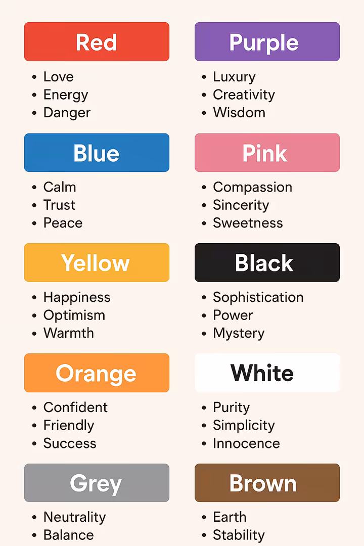
- Red: Most often linked with love (68% of respondents felt this). 38 Also tied to passion, excitement, energy, strength, danger, and urgency.40 It's a color that demands attention!
- Blue: Often connected to relief (35%). 38 It also signals calm, trust, stability, peace, wisdom, and sometimes a touch of sadness.40 Think of a clear sky or a tranquil sea.
- Green: Associated with contentment (39%). 38 It also represents nature, growth, harmony, health, freshness, balance, and renewal. Sometimes it can be linked to money or, on the flip side, jealousy.40
- Yellow: Strongly tied to joy (a whopping 52%!). 38 It also signifies happiness, optimism, attention, and warmth, but can sometimes imply danger or act as a warning (like a caution sign).40
- Orange: Also linked to joy (44%). 38 It evokes energy, enthusiasm, warmth, friendliness, and playfulness.40 It's a sociable and inviting color.
- Purple: Associated with pleasure (25%). 38 It also often represents luxury, creativity, spirituality, mystery, and wisdom.40 It has a touch of the regal and the magical.
- Pink: Commonly associated with love (50%). 38 It also suggests softness, femininity (in many cultures), playfulness, and youth.38
- Black: Most often linked to sadness (51%). 38 However, it also powerfully conveys sophistication, elegance, mystery, and grief.37 It's a color of extremes.
- White: Associated with relief (43%). 38 It also symbolizes purity, innocence, cleanliness, peace, and truth.37 Think fresh snow or a clean slate.
- Gray: Often linked to sadness (especially when grouped with black, 48%). 38 It also represents neutrality, balance, and sometimes sophistication, but can feel a bit dull or indecisive if overused.40
- Brown: Interestingly, associated with disgust by some in the survey (36%). 38 More broadly, though, it suggests earthiness, stability, reliability, and comfort.39 Think wood, earth, and a sense of grounding.
- Turquoise: Linked to pleasure (35%). 38 Often evokes feelings of refreshment, clarity, and a tropical escape.
It's super important to remember that hue, saturation, and brightness all play a part in how we react emotionally. For example, red hues typically get the biggest emotional rise out of us, while blue hues are generally the least arousing. A very bright and highly saturated color will usually trigger a stronger emotional response than a muted or desaturated one.38
Color Across Cultures: Different Meanings Around the World
While that big study suggests some universal emotional links to colors 38, the symbolic meaning of colors can be wildly different across various cultures and contexts.37 What shouts "joy" in one culture might whisper "mourning" in another. This is a super critical point for anyone working in global communication, branding, or design, you don't want to send the wrong message!
The symbolism of color is like a rich, complex tapestry woven from a few different threads: some innate human responses (perhaps to the physical properties of light wavelengths), learned associations from the natural world around us (like green being almost universally linked to plants and growth), and, most significantly, culturally constructed meanings that change over time and are passed down through generations.39 For instance, religious traditions have historically played a huge role in shaping what colors mean to us.45
Think about the work of linguists Brent Berlin and Paul Kay. In their groundbreaking 1969 book, Basic Color Terms: Their Universality and Evolution, they suggested that basic color words (like "black," "red," "green") pop up in languages in a predictable, universal order across different cultures.46 Their theory maps out seven stages, starting with languages that only distinguish dark-cool from light-warm (Stage I), then adding red (Stage II), then green or yellow (Stage III), and so on, eventually covering up to eleven basic terms.47 This hints at some underlying common ground in how humans categorize and see the color spectrum, even if the complex symbolic meanings we attach to these colors end up going in very different directions. The very existence of this kind of research highlights the tricky challenge of separating raw perception from culturally assigned significance.
The "universality" we see in broad cross-cultural surveys about emotional responses 38 might reflect dominant global trends, perhaps influenced by shared human experiences (like the color of the sky or blood) or our ever-increasing interconnectedness through globalization and shared media. However, these trends don't erase the deep and often subtle symbolic meanings that remain highly specific to particular cultures.
| Color | Common Western Association(s) | Example of Different Cultural Association(s) & Region |
| Red | Love, passion, danger, excitement, energy | Good luck, happiness, prosperity (China), Unluckiness (Chad, Nigeria), Traditional bridal color (China, India), Masculinity (UK, France).45 |
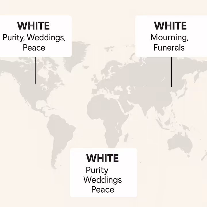
| White | Purity, innocence, weddings, peace, cleanliness | Mourning, death, funerals (some East Asian cultures like China and Japan, Ancient Egypt).45 |
| Black | Mourning, evil, sophistication, power, elegance, mystery | Confidence, independence (e.g., "black sheep" in Italy can be a positive, rebellious term), Rebirth (Ancient Egypt).45 |
| Blue | Calm, trust, sadness, stability, masculinity (common in US/Europe) | Femininity, warmth (Netherlands), Infidelity (some East Asian cultures), Purity, divinity (India, associated with Krishna), Mourning (Iran).45 |
| Green | Nature, health, luck, envy, money (US), go/permission | Jealousy (some European traditions), Danger (warning signs in Malaysia), Love, fertility (Japan), National color (Ireland, many Islamic countries).40 |
| Yellow | Happiness, sunshine, caution, cowardice, optimism | Mourning (Egypt), Courage, nobility (Japan), Infidelity (France), Envy (Germany, Russia), Sacred, auspicious (India).40 |
| Purple | Royalty, luxury, spirituality, creativity, wisdom | Evil, infidelity (Japan), Envy (Mexico), Mourning (Thailand, Brazil).45 |
Table 3: Color Symbolism: Global vs. Local. This table really shows how important it is to be aware of different color meanings across cultures.
Color and Life's Rhythms: Seasons, Gender, and Age
Beyond big cultural symbols, color associations also connect to the cycles of nature and the stages of our lives, though many of these are also shaped by culture.
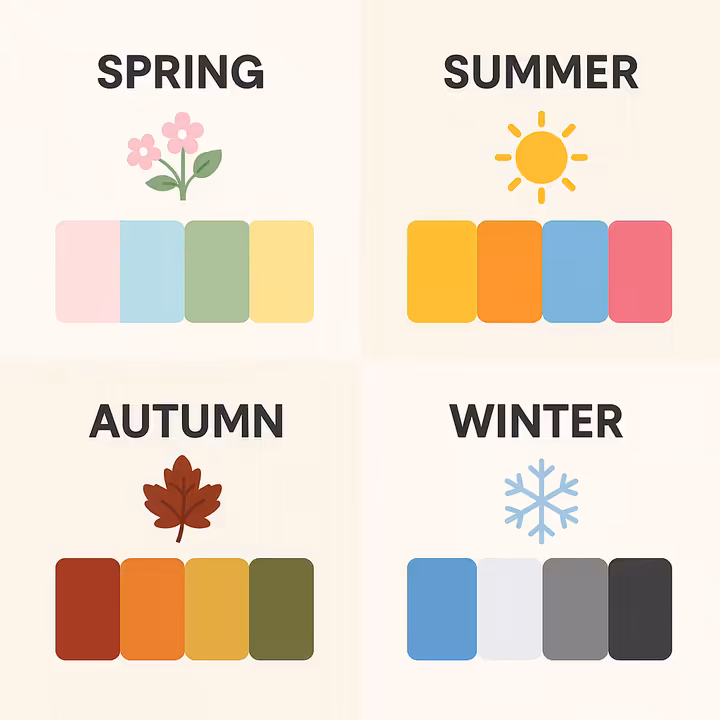
- Seasonal Colors: We often link distinct color palettes with the seasons, mostly because they mirror the colors we see in nature during those times.49 It's like nature has its own fashion sense!
- Spring: Think fresh pastels, light yellows, soft pinks, baby blues, and bright, lively greens. These colors shout renewal, new beginnings, optimism, and rejuvenation.50
- Summer: This season is all about vibrant, bold colors like sunny yellows, bright oranges, and clear blues. They reflect the sunshine, blooming flowers, and give off energy, happiness, and a carefree vibe.29
- Autumn: Characterized by rich earth tones, deep reds, burnt oranges, mustard yellows, warm browns, and olive greens. These colors mirror falling leaves and create a sense of comfort, coziness, and warmth.50
- Winter: Often linked to cool, deep shades like icy blues, crisp whites, silvers, and dark greys. But it also embraces rich jewel tones like emerald green or ruby red, and black for its ability to absorb heat. These can evoke calmness, clarity, protection, or a feeling of quiet stillness.50
- Gender-Related Preferences: In many Western cultures, we strongly associate pink with girls and blue with boys. However, research increasingly shows these preferences are largely learned from our culture rather than being hardwired from birth.51 Studies have found that a preference for pink in girls often pops up and gets stronger between ages 2 and 5 in industrialized societies where there's a lot of gendered marketing. But this preference is notably missing in small-scale societies with less exposure to global mass media.51 Some research has suggested adult females might lean towards reddish-purple hues while males prefer blue-green shades, but even these findings are debated and might be influenced by cultural factors rather than being purely biological.51 The very fact these socially constructed color associations exist powerfully influences behavior and preferences, but knowing they're constructed allows for more conscious, and maybe even rebellious, color choices in how we express ourselves and design things.
- Age-Related Preferences: What colors we like can also shift as we get older. For instance, some studies suggest that as people age, they might start preferring orange and various dark colors more, while their liking for bluish colors, purple, yellow, white, black, and light colors might decrease.52 Other research indicates that a preference for blue might decline with age, while a liking for red could increase.52 Often, younger people prefer light colors, while older individuals may lean towards darker shades.52
These associations, whether they're tied to seasons, gender, or age, significantly influence fashion trends, marketing strategies, and our personal choices. Understanding their often-constructed nature is key to interpreting and using color thoughtfully and with awareness.
A Colorful History: Key Moments in Color Theory
Our understanding of color hasn't just appeared out of thin air, it has evolved over thousands of years, shaped by deep thinkers, curious scientists, and groundbreaking artists. This journey shows a fascinating march from early philosophical ponderings to rigorous scientific investigations and profound artistic explorations.54
Early thoughts on color can be traced way back to antiquity. Figures like Aristotle (who died in 322 BCE) wrote a whole treatise called On Colors, and the ancient Indian text Nāṭya Shāstra (from around 200 BCE – 200 CE) described a practical theory with four primary colors.54 Renaissance geniuses like Leonardo da Vinci (around 1490) also explored color principles in their notebooks.54 However, the formal, more structured color theory we recognize today really started to take shape in the 18th century.
Sir Isaac Newton: Splitting Light, Revealing Spectrums (Opticks)
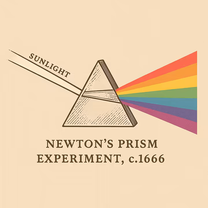
Sir Isaac Newton (1643-1727) completely changed the game for understanding color with his famous experiments in the 1660s. By passing a beam of sunlight through a glass prism, he brilliantly demonstrated that clear white light wasn't "pure" at all, but was actually made up of a spectrum of seven distinct colors: Red, Orange, Yellow, Green, Blue, Indigo, and Violet (you might remember them by the acronym ROYGBIV).2 This scientifically established the visible spectrum of light.
Newton's huge insight was that color isn't something inherently *in* objects themselves, but rather a property of light.54 Objects look colored because they reflect certain wavelengths of light and absorb others. His groundbreaking work, all documented in his highly influential book Opticks (published in 1704), laid the bedrock for the scientific study of color and how we see.55 He also created the very first color circle by bending the spectrum he observed and joining its ends, a direct ancestor of the modern color wheel we use today!57
Johann Wolfgang von Goethe: The Feeling of Color (Theory of Colours)
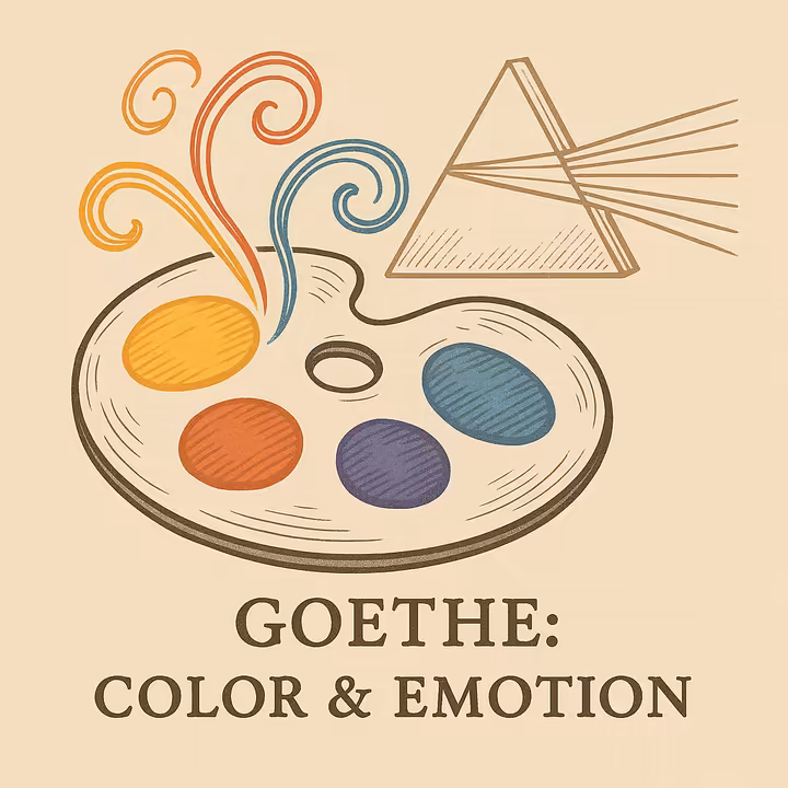
While Newton was all about the physics of light, the German poet, playwright, and all-around genius Johann Wolfgang von Goethe (1749-1832) came at color from a completely different angle. In his massive work, Theory of Colours (1810), Goethe put the spotlight on our actual experience of color, how it looks, feels, and affects us psychologically.11 He even challenged some of Newton's ideas, arguing that color arises from a dynamic dance between light and darkness, often happening through a "turbid medium" like the Earth's atmosphere.59
Goethe was fascinated by how colors affect human emotions and perception. He sorted colors based on their psychological impact, for instance, into "plus" colors (like yellow and red-yellow) that he believed induced positive feelings, and "minus" colors.58 He also delved into warm and cool color distinctions and their emotional effects, and firmly believed that how we see color was subjective and could be influenced by individual and cultural factors.59 Though his work was less a hard science treatise in the Newtonian sense and more a philosophical and observational deep-dive, Goethe's ideas profoundly influenced artists and really prefigured the whole field of color psychology by systematically studying the physiological and emotional effects of color.56
Johannes Itten: Bauhaus Brilliance and Color Contrasts (The Art of Color)
Johannes Itten (1888-1967) was a Swiss artist and a super influential teacher at the Bauhaus, the legendary German school of art, design, and architecture. Itten developed systematic ways to understand and use color, which had a massive and lasting impact on art education.54 He even created a "color star" (a cool variation of the color wheel) based on earlier models like Philipp Otto Runge's color sphere, designed to clearly show color relationships and their polar opposites.60
Itten is perhaps most famous for his theory of seven color contrasts, which he laid out in detail in his landmark book, The Art of Color (1961).60 These contrasts are like a toolkit for understanding how colors interact:
- Contrast of Hue: The pop you get when you put different pure colors next to each other (like red, yellow, and blue).
- Contrast of Light-Dark (Value): The difference between light and dark versions of colors, or light colors next to dark colors.
- Contrast of Cold-Warm: The zing from placing colors we see as warm (reds, yellows) next to cool ones (blues, greens).
- Contrast of Complements: The super strong contrast that happens when you put complementary colors (opposites on the color wheel) side-by-side.
- Simultaneous Contrast: This is how a color's appearance is affected by the colors right next to it. Sometimes, it can even make you see a hint of its complement in a neighboring neutral area. (He built on earlier work by Chevreul here).
- Contrast of Saturation (Quality): The difference between intense, pure, vibrant colors and dull, desaturated, muted ones.
- Contrast of Extension (Proportion): The contrast created by how much space different colors take up in a composition, the relative areas or proportions.
Itten's framework gave artists and designers a practical vocabulary and a set of tools for analyzing and using color with real intention.
Josef Albers: The Dance of Interaction (Interaction of Color)
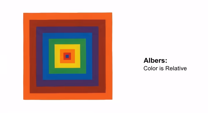
Josef Albers (1888-1976), another giant from the Bauhaus who later taught in the United States, dived even deeper into the subjective, ever-changing nature of color perception.54 His core idea, powerfully shown in his teaching and his famous "Homage to the Square" series of paintings, was that color is relative. How we see a color is almost entirely dependent on its context, the colors surrounding it.57 He famously said, "In visual perception a color is almost never seen as it really is, as it physically is. This fact makes color the most relative medium in art."57
Albers was all about learning by doing. He developed exercises that let students see with their own eyes how one single color could be made to look like two different colors, or how two different colors could be made to look the same, just by changing the colors next to them!57 His incredibly influential book, Interaction of Color (1963), isn't a stuffy book of theories, it's a record of an experimental way of studying and teaching color, packed with exercises designed to sharpen your visual perception.57 His work hammered home the idea that color "behaves" and "deceives," and understanding this constant interaction is absolutely crucial for any artist or designer.
The historical journey of color theory shows this fascinating back-and-forth between objective, scientific digging into the nature of light and pigment, and subjective, hands-on explorations of perception, psychology, and artistic expression. Thinkers like Newton laid the physical groundwork, while Goethe championed the human response. Later, educators like Itten and Albers gave us systematic yet experience-based frameworks for artistic practice. It often seems that the most influential texts and theories come from a deep personal fascination with color combined with a passion for teaching others. This blend of dedicated inquiry and a drive to share knowledge has shaped how we understand color today.
| Figure | Key Contribution(s) | Influential Text(s) | Era |
| Sir Isaac Newton | Prism experiments, discovery of visible spectrum (ROYGBIV), showing color is a property of light, created the first color circle. | Opticks (1704) | 17th-18th C. |
| J. W. von Goethe | Focused on the phenomenological and psychological experience of color, light-dark interaction, emotional impact of colors, warm/cool categories. | Theory of Colours (1810) | 18th-19th C. |
| Michel E. Chevreul | Detailed the law of simultaneous color contrast (how adjacent colors affect each other). | The Law of Simultaneous Color Contrast (1839) | 19th C. |
| Johannes Itten | Developed the seven color contrasts, influential Bauhaus color education, created a color star/wheel. | The Art of Color (1961) | 20th C. |
| Josef Albers | Emphasized the relativity of color ("interaction of color"), experiential learning through exercises, famous for "Homage to the Square" series. | Interaction of Color (1963) | 20th C. |
Table 4: Milestones in Color Theory. A quick who's who and what's what in the history of color.
Light vs. Ink: Understanding Color Models (RGB & CMYK)
When we want to create or reproduce color, whether it's glowing on a screen or printed on paper, we rely on color models. These are essentially systems for defining and representing colors using numbers. The two most fundamental types are additive and subtractive color models, and their big difference comes down to whether they're based on light or on pigment.
Additive Color (RGB): The Magic of Light on Our Screens
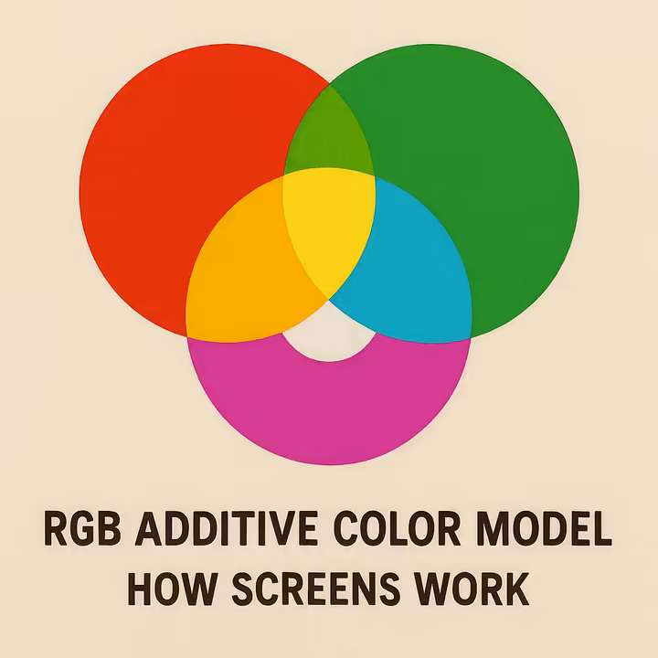
The Additive Color Model is all about light. The primary colors in this system are Red, Green, and Blue (RGB).5 This model is used for any device that actually emits light to create color, like your computer monitor, smartphone screen, TV, and digital camera.64
Additive mixing starts with black (which is just the absence of light). When you combine, or "add" together, red, green, and blue light in various intensities, they create a huge spectrum of other colors.64 It's like mixing light beams:
- Red light + Green light = Yellow light
- Green light + Blue light = Cyan light
- Blue light + Red light = Magenta light
And here's the coolest part: when all three primary colors of light (Red, Green, and Blue) are mixed at their full intensities, they produce pure white light.64 If all of them have zero intensity (no light), the result is black. This is why digital designers working for screens always use the RGB model.
Subtractive Color (CMYK & RYB): The Art of Pigment
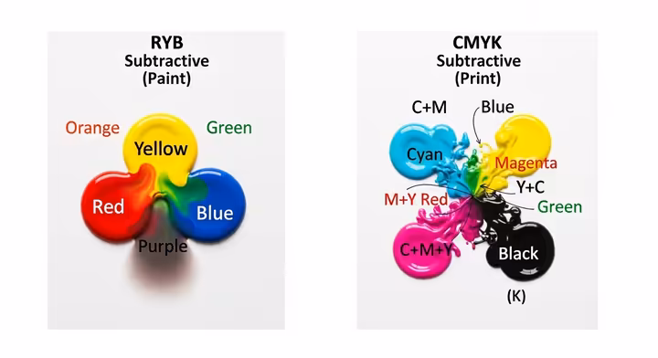
The Subtractive Color Model, on the other hand, is based on pigments, the stuff found in paints, dyes, and printing inks.5 This model works by subtracting or absorbing certain wavelengths of light and reflecting others. What we actually see is the light that is not absorbed by the pigment.
- RYB (Red, Yellow, Blue): This is the traditional subtractive primary set that artists have used for ages when mixing paints.8 When these pigments are mixed, they absorb more light, and the resulting color gets darker. Theoretically, mixing all three RYB primaries should give you black, but in real life, it often results in a muddy dark brown or grey.67 (Still useful for creating complex neutrals, though!)
- CMYK (Cyan, Magenta, Yellow, Key/Black): This is the subtractive model that powers professional printing.8 Here, Cyan, Magenta, and Yellow are the primary colors. When CMY are mixed, they also produce darker colors. Black (K, for "Key," not "blacK" as you might think!) is added for a few good reasons: CMY mixed together don't make a truly deep, rich black, black ink is often cheaper than mixing three colored inks to get a dark tone, and using black ink for text makes it super sharp and crisp.67
In subtractive systems, you usually start with a white surface (like paper), which reflects all colors of light. When you apply a pigment, say yellow, it absorbs the blue light and reflects red and green light, which our eyes see as yellow.66 The more pigments you add, the more light gets absorbed, and the darker the color becomes.66
The reason we have these two distinct models is all down to the fundamental physical differences between how light behaves and how pigment behaves. Light combines additively to get brighter and eventually white, while pigments combine subtractively to get darker. Getting this core distinction is vital for anyone working with color across different media, as it tells you which primary colors to use and how they'll mix, so you can get predictable and controlled results.
When to Use Which: A Simple Guide
Knowing which color model to use when is super important for getting your colors to look right:
- RGB: Use this for any design work that will be viewed on a digital screen .65 This includes websites, mobile apps, social media graphics, digital presentations, videos, and digital photos. If it glows, think RGB!
- CMYK: This is your go-to for any design work that will be printed .65 This means brochures, business cards, posters, books, magazines, and packaging. Most professional printers will need your files in CMYK format. If it's ink on paper, think CMYK!
- RYB: This model is primarily used in traditional art painting and art education. It's perfect for understanding how pigments mix when you're working with actual paints on a palette.68
It's a really good idea to design in the correct color mode from the very start of your project. If you create a beautiful design in RGB that's actually meant for print, it will need to be converted to CMYK. During this conversion, some colors, especially the really bright and vibrant ones, might look duller or even shift in hue. That's because the CMYK color gamut (the range of colors it can reproduce) is generally smaller than the RGB gamut.65 So, starting right helps avoid any disappointing surprises later!
| Feature | RGB (Red, Green, Blue) | CMYK (Cyan, Magenta, Yellow, Key/Black) | RYB (Red, Yellow, Blue) |
| Based On | Light (emitted) | Pigment (Ink, absorbs light) | Pigment (Paint, absorbs light) |
| Mixing Process | Additive (adds light) | Subtractive (subtracts light) | Subtractive (subtracts light) |
| Starts With | Black (no light) | White (paper surface) | White (canvas/paper surface) |
| How it Makes White | Mixing R+G+B light at full intensity | Absence of ink (white paper shows through) | Absence of pigment (white surface shows through) |
| How it Makes Black | Absence of R, G, & B light (no light) | Mixing C+M+Y (makes a dark, muddy color) + K (for true, rich black) | Mixing R+Y+B (theoretically, but often results in a muddy dark brown/grey) |
| Common Uses | Digital screens (monitors, phones, TVs, digital art) | Printing (brochures, books, posters, packaging) | Traditional painting, art education (mixing physical paints) |
| Brightness Effect | Adding more light makes colors brighter | Adding more ink makes colors darker (absorbs more light) | Adding more pigment makes colors darker (absorbs more light) |
Table 5: RGB vs. CMYK vs. RYB Color Models. A handy comparison of the main color models you'll encounter.
Color Theory in Action: Real-World Examples
Color theory isn't just some dusty old concept, it's a lively, dynamic force that shapes the visual world all around us. From the grand halls of art galleries to the friendly interface of your favorite app, its principles are always at play. Understanding these applications can help us appreciate the smart thinking behind color choices and give us the confidence to use color more effectively in our own creative projects.
Color in Art: Expressing Vision
Artists throughout history, whether they knew the formal "rules" or just had an amazing gut feeling, have harnessed the power of color to share ideas, stir emotions, and create visual experiences that grab us and don't let go. Different art movements are often instantly recognizable by their unique approaches to color.
Capturing Light: The Impressionists and Their Dazzling Palettes

The Impressionist movement, which burst onto the scene in the late 19th century, was totally revolutionary in how it approached color. A lot of this came from their burning desire to capture the fleeting, ever-changing effects of light and atmosphere.70
- How They Used Color:
- Instead of using boring old black or grey for shadows, Impressionists often used complementary colors placed next to each other. This created a sense of depth and made their paintings vibrate with life. For example, a shadow on a yellow object might be painted with little touches of violet. 70
- They famously used the "broken color" technique . This meant applying small dabs or short strokes of different pure colors side-by-side, letting them mix optically in the viewer's eye rather than being all blended together on the palette. It made their paintings shimmer! 70
- Many Impressionists painted on light-colored grounds (that's the first layer of paint on the canvas) to make their colors look even more luminous and bright. 71
- They tended to steer clear of dark, muddy earth tones like browns and blacks. Instead, they favored hues that were closer to the colors of the light spectrum: violets, blues, greens, yellows, oranges, and reds, often mixed with generous amounts of white to keep things bright. 71
- Famous Examples: Think of Claude Monet's "Impression, Sunrise" (which actually gave the movement its name!) or his breathtaking series of "Haystacks" and "Water Lilies." These beautifully show off his techniques. His "Autumn Effect at Argenteuil" really leans on complementary colors to capture the intense, golden light of a fall day.71 Pierre-Auguste Renoir's "Study: Torso, effect of sun" shows amazing, unconventional skin tones created by the play of colored light and shadow.71
Bold Expressions: The Fauvists' Color Revolution
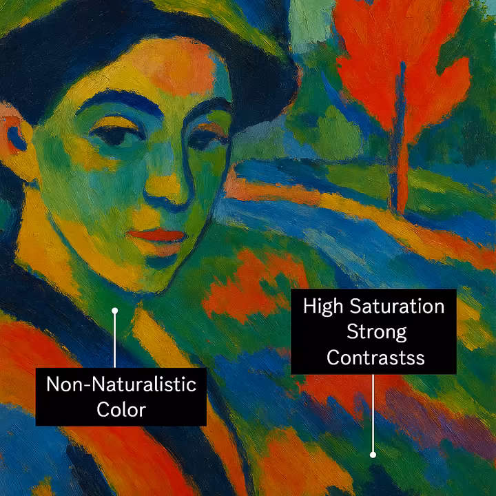
Around the turn of the 20th century, a group of artists known as the Fauvists ("wild beasts" in French, a nickname they got for their wild use of color!) took color in an even more radical direction. For them, emotional expression was king, way more important than realistic representation.72
- How They Used Color:
- Fauvists weren't shy! They used highly saturated, often unmixed pigments straight from the tube, slapping them onto the canvas with gusto. 72
- Their color choices were often completely non-naturalistic and even arbitrary . They picked colors for their emotional punch and expressive power, not to accurately show what something looked like in real life.72 So, a tree might be painted bright red, or a face might have patches of vibrant green and blue.
- They loved strong contrasts , frequently putting complementary colors at full saturation right next to each other to create a sense of energy, excitement, and dynamism. 73
- For the Fauves, color was liberated from its job of just describing things . It became the main way to share the artist's inner feelings and their subjective experience of a scene.73
- Famous Examples: Henri Matisse's "Woman with a Hat" (1905) and "The Joy of Life" (1905-06) are iconic Fauvist masterpieces that totally shocked audiences at the time with their bold, non-realistic use of color. André Derain's vibrant paintings of London, like "Charing Cross Bridge, London" (1906), also perfectly capture that wild Fauvist spirit.73
Vibrant Visions: Pop Art's Punchy Palettes
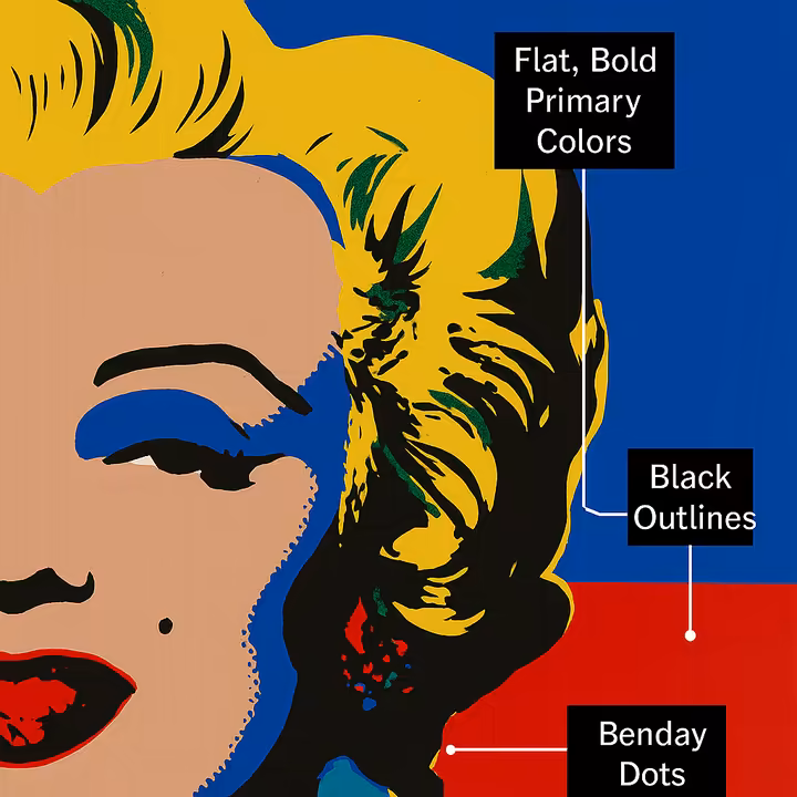
Popping up in the 1950s and 60s, Pop Art took its inspiration from everyday mass media, advertising, and consumer culture. And its use of color totally reflected this vibrant, commercial, in-your-face world.74
- How They Used Color:
- Pop Artists often went for vivid primary colors (think bold reds, yellows, and blues) and other bright, super-saturated hues.74
- High-contrast combinations were their jam, creating compositions that were visually striking and impossible to ignore.75
- Colors were typically applied in flat, unshaded areas , often outlined sharply in black, mimicking the look of comic books and commercial printing processes.75
- Techniques like Benday dots (those little colored dots used in printing to create tones and secondary colors) were famously adopted by artists like Roy Lichtenstein, giving their work that characteristic graphic feel.74
- Some artists even threw in fluorescent and neon colors to really amp up the sense of modernity and commercial energy.75
- Famous Examples: Andy Warhol's iconic screenprints of Marilyn Monroe or his Campbell's Soup Cans, and Roy Lichtenstein's large-scale paintings that look like they've jumped straight out of a comic strip, are quintessential examples of Pop Art's bold and graphic color language.74
Looking across these very different art movements, it's clear that color theory isn't a rigid instruction manual but more like a flexible language. Artists adapt and sometimes intentionally break the established "rules" to achieve their specific expressive goals, reflecting the cultural, intellectual, and personal vibes of their time. Impressionists used color to explore how we see, Fauvists for raw emotion, and Pop Artists to engage with (and sometimes critique) mass culture, all showing just how versatile color is as a tool for making meaning.
Color in Design: Solving Problems, Creating Experiences
Color theory is just as essential in the world of design, where it's used to solve practical problems, communicate messages clearly, and create specific experiences for users.
Graphic Design: Building Brands, Logos, and Posters That Pop
In graphic design, color is a fundamental building block of identity and communication.48 It's one of the first things people notice!
- How it's used: Colors are chosen very strategically to build a strong brand identity (think about Coca-Cola's red, you know it instantly!). They're used to evoke specific emotions (like blue for trust in financial institutions, or green for health-focused brands), ensure memorability (a unique color can make a brand stick in your mind), and guide the viewer's eye through a design.48 Color harmonies are carefully picked to match the brand's message and connect with its target audience.
- Examples: The Coca-Cola logo uses a vibrant red and crisp white scheme to convey excitement, energy, and a classic feel.48 The Google logo uses a playful primary color scheme (blue, red, yellow, with green as a secondary) to create a sense of fun, innovation, and approachability.48
Web Design & UI/UX: Crafting Smooth User Experiences
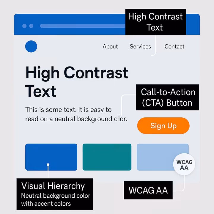
For websites and apps, color theory is absolutely vital for creating user experiences (UI/UX) that are intuitive, accessible to everyone, and enjoyable to use.77
- How it's used:
- Readability is Key: Good contrast between text and background colors is essential for making content easy to read, especially for users who might have visual impairments.77
- Guiding Interaction: Colors help highlight interactive elements like buttons and links, showing users where they can click or tap. Call-to-Action (CTA) buttons often use bright, contrasting colors (like a bold red or orange) to make them stand out and encourage clicks.77
- Creating Visual Hierarchy: Different colors and values help organize information on the page and guide the user's attention to the most important content first.
- Reflecting Brand Personality: The color scheme reinforces the brand's identity and the emotional tone it wants to set (for instance, a modern fintech app might use blues and greens to convey trust, security, and growth).77
- Thinking About Accessibility: Following guidelines like the Web Content Accessibility Guidelines (WCAG) for color contrast is crucial to make sure everyone can use the site or app.77
- Finding Balance: Plenty of white space (or negative space) and neutral colors are used to balance out bolder colors, prevent visual clutter, and help users focus on what matters.77
- Examples: Many financial and tech companies like PayPal, IBM, and Facebook use blue prominently in their branding and interfaces to build a sense of reliability, trust, and security.77 E-commerce sites often use eye-catching reds or oranges for "Buy Now" or "Add to Cart" buttons to create a sense of urgency and encourage action.77 And the classic dark text on a white background (or vice-versa in "dark mode") is a common choice for optimal readability.78
Interior Design: Setting Moods and Shaping Our Living Spaces
Interior designers are like color magicians for our homes and workspaces. They use color theory to transform spaces, create specific atmospheres, and reflect the personalities of the people who live or work there.81
- How it's used:
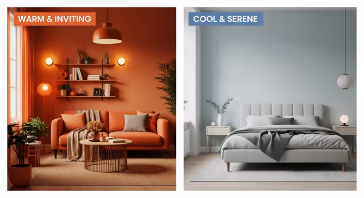
- Creating the Right Mood: Warm colors (reds, oranges, yellows) can make a room feel energetic, inviting, and cozy, perfect for social spaces like living rooms and dining areas where you want people to gather and chat.22 Cool colors (blues, greens, purples) tend to create a sense of calm and relaxation, making them great for bedrooms, bathrooms, or studies where you want to unwind or focus.22
- Playing with Spatial Perception: Light colors can make a room feel larger, more open, and airier, a great trick for smaller spaces. Dark colors, on the other hand, can make a space feel cozier, more intimate, or even grander and more dramatic if used well.81
- Highlighting Features: An accent wall painted in a bold color, or colorful architectural details, can draw the eye and add depth and interest to a room.
- Bringing in Texture (and More Color!): Color isn't just about paint on the walls! It's also introduced through fabrics (curtains, rugs, upholstery) and decorative items (pillows, artwork). These also bring in different textures, which interact with how we perceive the colors.81
- The Power of Neutrals: Neutral colors (like whites, greys, and beiges) are super versatile. They provide a calm backdrop, balance out more vibrant hues, and can make small spaces appear larger and less cluttered.81
- Examples: Soft blues and greens are often recommended for bedrooms to help promote tranquility and restful sleep.82 Warm yellows or inviting oranges might be used in kitchens or dining areas to encourage conversation and even stimulate appetite!82
Fashion Design: Weaving Trends, Collections, and Self-Expression

In the world of fashion, color is a language all its own. It's used to convey mood, reflect the latest trends, build a brand's signature style, and allow for powerful personal expression.34 What you wear can say so much!
- How it's used:
- Making an Emotional Impact: Designers use color psychology all the time, red for passion or high energy, blue for calmness or a professional look, to evoke specific feelings in their collections and in the people who wear them.34
- Harmonious Collections: Fashion collections are often built around specific color harmonies (like monochromatic, analogous, or complementary) to create looks that are cohesive, visually appealing, and tell a story.83
- The 3-Color Principle (or 60-30-10 Rule): A common guideline in fashion styling suggests using a dominant color, a secondary color, and an accent color in an outfit to create a balanced and put-together appearance.34
- Trends, Statements, and Throwbacks: Fashion history is full of evolving color trends, from the rich, jewel-toned colors of Art Deco in the 1920s, to bold solid colors in the 1960s, eye-popping neons in the 1980s, and chic minimalism in the 1990s.83 Current trends might include color blocking (using solid blocks of different colors together) or a love for soft pastels.83
- Examples: A monochromatic tailored suit (all black, or all navy) can create a strikingly elegant and powerful style.83 A more casual everyday look might combine a white t-shirt (neutral base), blue jeans (dominant color), and a bright red scarf or handbag (accent color).34
Across all these diverse design fields, from the glowing screen of your phone to the cozy corner of your living room, and from a magazine cover to the clothes on your back, color theory provides a shared vocabulary and a common set of guiding principles. Designers adapt these core concepts (like the color wheel, harmonies, psychological impact, and properties like value and saturation) to meet the unique aesthetic and functional goals of their specific medium and audience. This just goes to show how fundamental and wonderfully versatile color theory really is!
Color in Your Daily Life: Easy Ways to Apply Color Wisdom
Color theory isn't just for the pros, you can use its principles to make more informed, confident, and satisfying choices in your everyday life:
- Choosing Your Outfit: Think about the mood you want to project. Feeling bold? Maybe a splash of red. Need to feel calm for a big presentation? Perhaps some cool blues. You can use that "3 Color Principle" (dominant, secondary, accent) for a balanced look that feels intentional.34 Also, consider colors that complement your natural skin tone, hair, and eye color (this often ties into "seasonal color analysis," where personal coloring is matched to palettes that resemble spring, summer, autumn, or winter, it can be fun to explore!).
- Decorating a Room: Don't know where to start? Pick a color you absolutely love, maybe from a piece of art, a favorite rug, or a fabric swatch. Then, use the color wheel and harmony principles to build a palette around it.84 For a calming bedroom oasis, an analogous scheme (like different shades of blues and greens) could work beautifully. For a lively living room where you entertain, you could use a complementary color as an exciting accent against a more neutral background.85 Always think about the room's main job and how much natural light it gets, that can really change how colors look and feel.
- Planning Your Garden: Want a garden that looks like a masterpiece? Arrange plants with analogous flower or foliage colors for a serene, beautifully blended look (imagine various shades of pink, lavender, and purple flowing into each other). For more excitement and pop, use complementary colors as focal points (like bright yellow daffodils planted near deep purple irises, wow!). Also, think about when different plants bloom to ensure you have a lovely succession of color throughout the seasons.
Color in Business: Branding and Marketing Impact

Businesses, big and small, understand the immense power of color in shaping how consumers see them and what they do.
- Branding that Sticks: Color is a super critical part of a brand's identity. It can convey meaning almost instantly, without a single word being read.35 Consistent use of a brand's signature color(s) can boost brand recognition by up to 80%, that's huge!35 In fact, studies suggest that up to 90% of a consumer's first impression of a product can be based on color alone.35 Brands carefully pick colors to match their personality and the message they want to send:
- UPS famously uses brown to symbolize dependability, reliability, and solidity.86 You trust them with your packages!
- FedEx cleverly uses green for its ground services (which can connote reliability and earthiness) and a vibrant orange for its air transportation (suggesting speed, energy, and urgency).86
- T-Mobile's distinctive magenta helps it stand out loud and proud in a very crowded mobile marketplace.86
- Many fast food chains often use red and yellow in their branding and restaurants. These colors are thought to create excitement, grab attention, and even encourage quick decision-making (and maybe even make you feel a bit hungrier!).35
- Tech companies frequently opt for shades of blue to convey trust, innovation, intelligence, and reliability.35
- Marketing and Retail Design: That 60-30-10 rule we talked about for outfits and interiors? It's often applied in branding and marketing materials too, creating a balanced and professional look.35 Retail spaces also use color very strategically to attract customers, create specific shopping atmospheres (e.g., luxurious and exclusive, budget-friendly and accessible, or energetic and trendy), and even guide shoppers through the store to different departments or promotions.
The Power Duo: Contrast and Value in Design
Beyond just picking nice colors, the way colors interact, especially their contrast in terms of hue, saturation, and most importantly, value, is absolutely critical for creating visual communication that's not only attractive but also effective and accessible to everyone. Understanding these dynamics can take a design from being merely decorative to truly functional and user-friendly.
The Chameleon Effect: Simultaneous Contrast (Albers Revisited)
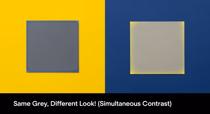
One of the most mind-bending and fascinating things about color perception is simultaneous contrast. This is the phenomenon, so brilliantly explored by Josef Albers, that describes how the appearance of a color is dramatically affected by the colors right next to it.17 It's like colors are social creatures, constantly influencing each other! A single color can appear lighter or darker, warmer or cooler, or even seem to shift its hue entirely, all depending on its background or its neighboring colors.88 For instance, a medium grey square will look noticeably lighter when you put it on a black background, and significantly darker when you put it on a white background. Similarly, a neutral grey can suddenly appear tinged with the complement of a strong color placed beside it. This happens because our eyes and brain are always working to differentiate and even intensify the differences between adjacent colors, it's like they're trying to make each color stand out more clearly from its neighbors.17
Albers' famous exercises, like making one color look like two different colors, or making two different colors look almost identical, all hinge on this incredible principle of simultaneous contrast.62 This really hammers home his central idea that color is "the most relative medium in art" 57 and is almost never seen as it physically is in isolation. Understanding simultaneous contrast is vital for any artist or designer because it explains why those colors you so carefully picked from a palette might look unexpectedly different, and sometimes disappointing, when you actually place them together in your final composition or design.
Light vs. Dark: Value for Clarity and Focus
While contrast of hue (different colors) and saturation (intensity) are important, value contrast, that's the difference in lightness or darkness between elements, is arguably the most crucial factor for creating a clear visual hierarchy and ensuring that things are easy to read.89 When there's a strong difference in value between, say, your text and its background, the text becomes much, much easier to read.89 This is because our eyes are highly sensitive to differences in luminance (another word for brightness or lightness).
Value contrast also helps to establish which elements in a design are the most important. Elements that have higher contrast against their surroundings tend to pop out more, drawing the viewer's attention first.89 Designers use this trick all the time to guide the user's eye through a composition, making sure that people notice headings, buttons, or key pieces of information in a logical and effortless order.
The Greyscale Check: A Designer's Secret Weapon
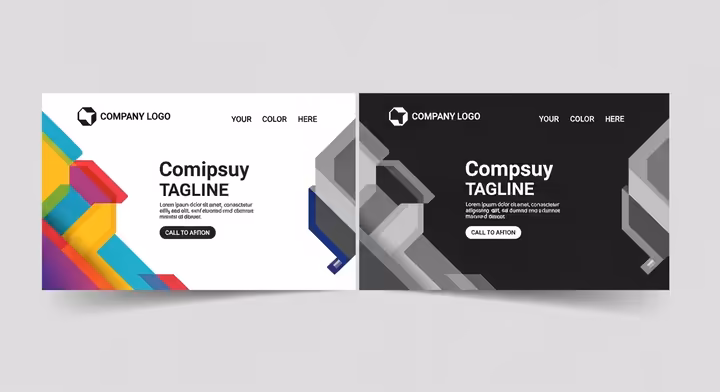
Here's a simple yet incredibly powerful technique for checking your value contrast: the greyscale check. It's exactly what it sounds like: you convert your color design into greyscale (just black, white, and shades of grey) to see how the different color elements translate into different shades of grey.91 If elements that need to be distinct from each other (like text on a background, or a button against the panel it's on) kind of blend together or become hard to tell apart in greyscale, that's a big red flag. It means their value contrast is too low, even if their hues (the actual colors) are very different.92 For example, a bright red and a bright green might offer super strong hue contrast, but they can actually have very similar values (lightness/darkness). This would make them difficult to distinguish for people with certain types of color vision deficiency, or even for anyone in low-light conditions. The greyscale check cleverly removes hue and saturation from the picture, allowing you to clearly assess the all-important value relationships.93
Designing for Everyone: Accessibility and Color Contrast
The importance of value contrast goes hand-in-hand with web accessibility, making sure websites and digital content can be used by everyone, including people with disabilities. The Web Content Accessibility Guidelines (WCAG) provide specific, measurable recommendations for the minimum contrast ratios needed between text and its background to ensure that content is readable by people with visual impairments, including those with low vision and various forms of color blindness.79
For WCAG 2.1 Level AA compliance (which is a widely adopted standard):
- Normal-sized text should have a contrast ratio of at least 4.5:1 against its background.
- Large text (which is defined as 18 point, or 14 point if it's bold) should have a contrast ratio of at least 3:1 .79
And if you're aiming for the gold standard, Level AAA compliance requires even higher contrast ratios (7:1 for normal text, and 4.5:1 for large text).79
These guidelines also stress a really important point: color should not be used as the only way of conveying information, indicating an action, or distinguishing a visual element.79 For instance, if an error message on a form is only indicated by turning the text red, someone who can't perceive red well (or at all) might completely miss it. A better approach would be to accompany the color change with an icon (like an exclamation mark) or additional explanatory text.
So, using value and contrast effectively goes way beyond just making things look aesthetically pleasing. It's a fundamental aspect of inclusive design, ensuring that visual information is perceivable, understandable, and usable by the broadest possible audience. This elevates the discussion of contrast from simply "making things look good" to an ethical and functional necessity in modern design practice. And those fascinating principles highlighted by Albers about how relative and potentially deceptive color perception can be? They further underscore why clear, unambiguous contrast is so incredibly critical, especially when you're trying to convey essential information.
Oops! Sidestepping Common Color Blunders
Jumping into the world of color is super exciting, but it's pretty easy for beginners (and hey, even seasoned pros sometimes!) to take a tumble. Understanding some common color mistakes and knowing how to fix them can save you a ton of frustration and lead to much more successful and harmonious results. Let's look at a few common pitfalls.
Common Stumbles: Too Many Colors, Saturation Overload, and More
Several typical missteps can easily undermine an otherwise good design or piece of artwork:
- The "Too Many Cooks" Syndrome (Too Many Colors): Throwing an excessive number of different hues into one design can create a visual cacophony, it looks chaotic, unfocused, and can be really overwhelming for the viewer.93 As a general rule of thumb, especially when you're starting out, sticking to two or three main colors, perhaps with some trusty neutrals like white, grey, or beige, is often much more effective and easier to manage.93
- Saturation Overdrive: The allure of bright, intense, super-saturated colors is strong, we get it! But using too many highly saturated colors all at once can be visually jarring, tiring for the eyes, and can make a design look a bit amateurish or unsophisticated.93 Think of saturation like a potent spice, a little can go a long way and add amazing flavor, but too much just overpowers everything else.93 It's often a good strategy to start with mid to low saturation levels and then carefully dial it up where needed for emphasis.
- The "Invisible Ink" Problem (Poor Value Contrast): This is a very common issue where the colors you've chosen are too similar in their lightness or darkness.93 This makes different elements hard to distinguish from each other, text incredibly difficult to read, and the overall design can end up looking flat, muddy, or just plain confusing. Remember that greyscale check we talked about? It's your best friend for spotting this one!
- Ignoring Color Relationships (Harmony Hijinks): Choosing colors randomly, without considering how they relate to each other on the color wheel (those lovely harmonies like complementary, analogous, etc.), often leads to combinations that clash, feel discordant, or just don't "sit right" together.
- Forgetting About Context (The Chameleon Strikes Again): Colors can look dramatically different depending on the lighting conditions, the colors surrounding them (hello, simultaneous contrast!), and the medium in which they're used. What looks fantastic and vibrant on your backlit computer screen might not translate well to a printed brochure or a painted wall in your living room.
Many of these "color mistakes" pop up because of an incomplete understanding of how all the different pieces of the color puzzle fit together: the fundamental properties of color (hue, value, saturation), the characteristics of pigments or light, those established color relationships (harmonies and contrasts), and even the final viewing conditions. Fixing these issues effectively usually requires a more holistic approach rather than just a single quick fix.
Muddy Mixes No More: Tips for Clear Pigment Mixing
"Muddy" colors are a classic frustration for painters, especially those working with physical pigments like oils, acrylics, or watercolors. Muddying typically happens when your colors lose their clarity and vibrancy, often ending up as dull, desaturated brownish or grayish tones that just look... well, muddy. Here’s a peek at why it happens and how you can steer clear:
- Know Your Pigments: Not all paint pigments are created equal! Some are transparent , meaning they allow light to pass through them and bounce off the white paper or canvas underneath, creating a beautiful luminosity (especially key in watercolor). Others are opaque , meaning they block light and completely cover whatever's underneath.95 Mixing too many opaque colors together, especially if they're complementary colors, is a super quick route to a muddy mess.95 Transparent colors, even when you mix them to create dark shades, are far less likely to turn into mud.95 Also, knowing if your paints are staining or non-staining, sedimentary (granulating), or reflective can help you predict how they'll behave when mixed.95
- The Complementary Color Trap: Remember how complementary colors (like red and green, or blue and orange) are opposites on the color wheel? Mixing them together will neutralize each other, producing greys or browns. While this is incredibly useful when you *want* to create interesting neutrals or dull down a color intentionally, accidentally overmixing them or unintentionally introducing complements into your mix is a prime cause of mud.
- The Overmixing Vortex: Vigorously stirring too many colors together on your palette for too long, or overworking your paint on the canvas by brushing it back and forth endlessly, can quickly lead to a homogenous, dull, and lifeless result.
- Too Many Pigments in the Pot: Generally, the fewer individual pigments you use in a single mix, the cleaner and more vibrant your resulting color will be. Each pigment you add subtracts more light, and too many can just suck the life out of your color.
Tips to Fix or Avoid Those Dreaded Muddy Colors:
- Embrace Transparent Pigments: Especially if you're a watercolorist, using predominantly transparent pigments will help your colors sing and maintain their luminosity.95
- Mix Complements Wisely (and Sparingly): If you need to dull down a color, add just a tiny touch of its complement. If you want vibrancy from complements, try placing them next to each other (for that lovely simultaneous contrast pop!) rather than mixing them extensively.
- Keep It Clean: Dirty brushes or a messy palette are notorious for introducing unwanted, muddying colors into your beautiful mixes. Rinse those brushes often!
- Less is More (in a Mix): Try to achieve your desired color with just two or, at most, three different pigments if you possibly can.
- Patience with Layers: When you're layering paints (especially with acrylics or oils, which can be reworked), allowing layers to dry properly before adding the next can prevent unintentional physical mixing on the canvas that leads to muddiness.
- The Watercolor "Oops" Button (Lifting): If a watercolor passage does turn muddy and your paints are non-staining, you might be able to gently "lift" some of the paint. Carefully re-wet the area and then use a clean, damp (not soaking!) brush or a bit of sponge to blot up some of the color.96
- The Opaque Cover-Up: If mud is unavoidable and you're working with opaque media like acrylics or oils (or even gouache over a watercolor wash), sometimes the best solution is to let the muddy area dry completely and then bravely paint over it with a cleaner, more opaque layer.96 Fresh start!
Calming the Clash: Reharmonizing Colors
Color clashes happen when adjacent colors create a jarring, uncomfortable, or visually vibrating effect that just doesn't feel right. This often occurs with high-contrast combinations that aren't properly harmonized, or when colors with very different "personalities" are forced together without a peacekeeper.
- Dial Down the Drama (Reduce Contrast): One of the simplest fixes is to adjust the value (lightness/darkness) or the saturation (intensity) of one or more of the clashing colors.97 Making one color a bit lighter, darker, or duller can often instantly resolve the tension and make them play nicer together.
- Introduce a Neutral Peacekeeper (Buffer Color): Placing a neutral color (like a soft white, a calm grey, or even black if appropriate) or a color that harmonizes well with *both* of the clashing hues *between* them can act as a visual separator and mediator.97 This "buffer" gives the eye a little place to rest and reduces that direct, jarring interaction.
- Blend with a Unifying Friend (Common Color): In some situations, like textile design or certain painting techniques, subtly blending both clashing colors with a third, unifying color can reduce their harsh contrast and create a more cohesive, harmonious look.97 This could be achieved through optical mixing (like using tiny dots or threads of different colors that blend in the viewer's eye) or by physically mixing a tiny bit of a common color into both clashing colors.
- Adjust the Guest List (Proportions): Sometimes, a clash isn't so much about the colors themselves but more about how much of each color you're using. Changing the dominance of one color over another, making one more of a main feature and the other more of an accent, can significantly alter their relationship and calm things down.
- Consult the Map (Revisit the Color Wheel): If your colors are seriously clashing, they might not be part of a recognized harmony, or they might be an "ill-fitting" or extreme version of one. Try adjusting your selection to align more closely with a standard harmony like analogous, split-complementary, or triadic. You can do this by subtly shifting the "distance" between the colors on the wheel until they feel more comfortable together.98
Light's Impact: Adapting Colors for Different Lighting
The appearance of a color is hugely dependent on the lighting conditions under which you're viewing it.99 Light sources vary quite a bit in their color temperature (we'll dive into this a bit more in the next section), and this directly affects how colors are rendered to our eyes.
- Natural Daylight: This is often considered the most neutral light source, giving the truest color rendition. However, even daylight changes throughout the day, it's much warmer (more yellowish/orangish) at sunrise and sunset, and cooler (more bluish) around midday.
- Incandescent Light (Old-school bulbs): This light tends to be very warm (yellowish/orangish). It will enhance warm colors like reds, oranges, and yellows, making them look richer, but it can make cool colors like blues and greens appear duller or even shift their hue slightly (a blue might look a bit greenish, for example).
- Fluorescent Light (Often in offices/stores): This can vary widely. Some fluorescent lights are quite cool (bluish), while others are designed to be warmer. Cool fluorescent light can make warm colors look less vibrant and can intensify blues and greens, sometimes making them look a bit harsh.
- LED Light: The great thing about LEDs is that they're available in a massive range of color temperatures, from very warm and cozy to very cool and crisp. This gives a lot of control, but you still need to be aware of what you're choosing!
Tips for Adapting Your Colors to Light:
- Test Colors in Their Natural Habitat: This is crucial! Always, always try to view your color samples (like paint chips for a room, or fabric swatches for an outfit) in the actual lighting conditions where they will be used. If natural light is a big factor (like in a room with large windows), check them at different times of day to see how they change.99
- Consider the Light Source's "Temperature": Be aware of whether the main light source in a space is generally warm or cool, and think about how that will interact with your chosen color palette. Will it enhance your colors, or fight against them?
- For Critical Color Tasks (e.g., retail displays, art galleries, photo studios): Professionals in these fields don't leave lighting to chance. Lighting designers carefully select light sources with specific color temperatures and a high Color Rendering Index (CRI, a measure of how accurately a light source shows colors compared to natural daylight) to ensure colors are displayed accurately or to create a very specific desired ambiance.101
- The Digital-to-Physical Shift: And always remember that colors glowing on your backlit RGB computer screen will almost certainly look different when they're printed in CMYK on paper or painted with RYB pigments onto a canvas. This is partly due to the different color models (additive light vs. subtractive pigment) and partly due to how ambient light interacts with a physical, reflective surface. So, screen previews are helpful, but physical proofs or samples are king!
Level Up: A Peek into Advanced Color Topics
Once you've got a good handle on the fundamentals of color theory, a whole new world of even more nuanced and specialized concepts opens up. These are topics that professionals in various fields really dive deep into. Here's a quick peek at a few of them.
The Science of "Warm" and "Cool": Color Temperature in Kelvin
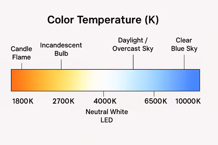
We've chatted about warm and cool colors as a way we perceive them, a sort of feeling they give off. But color temperature also refers to a very specific, measurable characteristic of visible light sources, and it's measured on the Kelvin (K) scale.100 This scale describes the color appearance of light that would be emitted by an idealized "black-body radiator" (a theoretical object) as it gets hotter and hotter.
- Lower Kelvin values (e.g., around 1850K - 3000K) correspond to "warmer" light, which appears more yellowish, orange, or even reddish. Think of the cozy glow of a candle flame (around 1850K), a standard old-fashioned incandescent light bulb (around 2400-2700K), or the beautiful light at sunrise or sunset.100
- Mid-range Kelvin values (e.g., around 3500K - 4500K) are often considered to be "neutral" or "natural white" light. This is often a good target for general indoor lighting if you want colors to look fairly balanced.102
- Higher Kelvin values (e.g., around 5000K - 10000K) correspond to "cooler" light, which appears more bluish. Examples include average daylight (around 5500-6500K, though it varies), the light from an overcast sky, or some types of LED and fluorescent lights.100
Understanding color temperature is super crucial in fields like photography, filmmaking, lighting design for homes and businesses, and even calibrating your TV or computer monitor. It helps ensure that colors are rendered accurately under different lighting sources, or it allows for the intentional creation of specific moods (like warm, inviting lighting for a cozy restaurant, versus cool, crisp lighting for an office to perhaps enhance concentration).100 Digital cameras, for example, have "white balance" settings. These settings try to adjust for the color temperature of the ambient light so that objects that are white in real life actually look white in the final photo, not yellowish or bluish.100
Mind Benders: Color-Based Optical Illusions
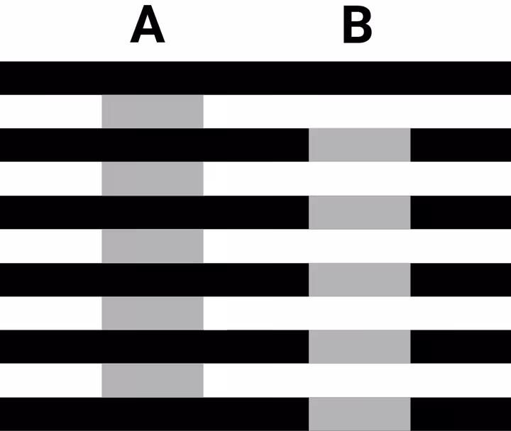
The fact that our perception of color is so subjective and highly dependent on context leads to some absolutely fascinating optical illusions. These are situations where our eyes and brain get "tricked" into seeing something that isn't physically there, or seeing the same thing in very different ways. They're not just fun curiosities, they teach us a lot!
- Simultaneous Contrast Illusions (Albers' Playground!): As we saw with Josef Albers' work, the appearance of a color can change dramatically based on its background or the colors right next to it. A grey square can look darker on a light background and lighter on a dark background, or even seem to take on a complementary tint from a strongly colored neighbor.88 Our brain is working hard to make sense of the relationships!
- The Munker-White Illusion (Color Assimilation): This is a really cool one! In this illusion, the color of elements in the foreground (like thin stripes) can appear to "bleed" into or alter the perceived color of elements in the background.104 For example, a set of identical beige or grey spheres can appear to be red, purple, or green if they are overlaid with thin stripes of those respective colors. It's because the sphere's color starts to assimilate, or take on, the color of the stripes that are crossing over them.104
- Color Afterimages (Stare and See!): Try this: stare intently at a specific, bright color for a prolonged period (say, 30 seconds or so) and then quickly shift your gaze to a neutral white or grey surface. You'll often see a fleeting image of its complementary color!88 This happens because the cone cells in your eyes that were responding so strongly to the original color get a bit fatigued. When you look away, the less fatigued cones for the complementary colors briefly take over, creating the afterimage.
These illusions aren't just neat party tricks, they provide valuable insights into the incredibly complex processes of our visual perception. They reinforce the idea that what we "see" is an active construction by our brain, not just a passive recording of reality. Our brain is constantly interpreting!
Ensuring Consistency: Professional Color Matching Systems
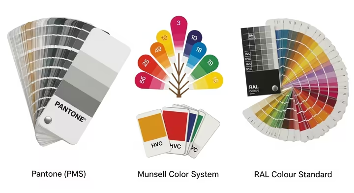
In many industries, from graphic design and printing to manufacturing cars and fashion, getting precise and consistent color reproduction is absolutely critical. Imagine if your favorite brand's logo looked a different shade of blue on their website, their packaging, and their delivery trucks! To avoid this chaos and ensure everyone is, quite literally, on the same page (or screen, or product), professionals rely on standardized color matching systems. These systems provide a common, objective language for specifying and communicating color. They make sure that a particular shade of blue, for example, looks the same whether it's printed on a brochure in New York, on packaging manufactured in Shanghai, or painted on a product in Germany.
- Pantone Matching System (PMS): This is probably the most widely known system. Pantone provides a vast library of proprietary, numbered "spot colors" (which are solid, pre-mixed inks rather than colors created by mixing CMYK dots). These are used extensively in graphic design, printing, and product design.105 Each Pantone color has a specific ink formulation, allowing for highly consistent reproduction across different printers and materials. They also have specialized systems for textiles, plastics, and other materials (like their Fashion, Home + Interiors - FHI system).105
- Munsell Color System: Developed by Albert H. Munsell around the turn of the 20th century, this system defines colors based on three perceptual dimensions: Hue, Value, and Chroma (HVC) (Chroma is similar to saturation).105 It's a more scientifically organized, perceptually uniform system. It's used in a wide variety of industries and scientific applications, like the Munsell Soil Color Charts used by geologists and archaeologists to classify soil types, and even in government standards for things like electrical wire colors or USDA food grading.105
- RAL Colour Standard: This is a color matching system that's primarily used in Europe, especially for specifying colors for varnishes, powder coatings, and plastics in industrial and construction applications. If you're choosing paint for industrial equipment or architectural elements in Europe, you'll likely encounter RAL colors.
These systems move beyond subjective artistic interpretation ("a nice sky blue") to provide objective, measurable control and clear communication of color. This is particularly vital in our globalized economy where brand identity, product consistency, and technical specifications all depend on precise color fidelity. The development and widespread use of such systems reflect an increasing need for this kind of objective color management in our technologically advanced and interconnected world.
Your Color Adventure Continues: Tools & Resources
Understanding color theory isn't a one-time thing, it's an ongoing adventure, filled with constant discovery and practical application. The more you learn, the more you see! Fortunately, there's a wonderful wealth of resources out there to help you explore further, experiment with confidence, and deepen your appreciation for the amazing world of color.
Digital Tools: Online Palette Generators
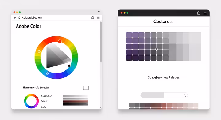
For anyone working digitally, or even if you're just looking for quick color inspiration for a home project, online color palette generators are absolute lifesavers. These clever tools can help you:
- Quickly create color schemes based on those established harmonies we talked about (monochromatic, analogous, complementary, triadic, etc.).
- Magically extract a palette of colors from an image you upload (great for matching colors to a photo you love!).
- Explore trending color palettes created and shared by other users, instant inspiration!
- Fine-tune hues, saturation, and values with easy-to-use interactive controls.
- Check color contrast ratios to make sure your choices are accessible and readable.
- Export your beautiful new palettes in various formats for use in your favorite design software.
A couple of popular and really helpful ones include:
- Adobe Color (you can find it at color.adobe.com): This is a super powerful tool, especially if you use Adobe Creative Cloud apps, as it integrates nicely. It offers various harmony rules, an "Explore" feed full of palettes from the community, and the ability to save palettes directly to your Adobe libraries.107
- Coolors.co : This one is known for being incredibly fast and user-friendly. You can generate, save, and share palettes in a snap (hitting the spacebar to get new random palettes is oddly addictive!). It also offers handy browser extensions and mobile apps so you can create on the go.108
Tactile Tools: Physical Color Aids
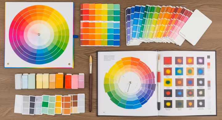
For those who love a more hands-on approach, especially when working with physical media like paints, several traditional tools are still absolutely indispensable and wonderful to use:
- Artist Color Wheels: These are physical, often double-sided, rotating wheels that give you a fantastic visual demonstration of color relationships. One side typically shows you how primary colors mix to create secondary and tertiary colors. The other side often helps you identify different color harmonies (complementary, triadic, etc.) and illustrates how to create tints, tones, and shades.110 Some even include a handy greyscale value finder to help you judge lightness and darkness.111 They're excellent for quick reference, learning, and sparking ideas right at your painting table.
- Paint Swatches/Chips: You can get these from paint manufacturers (like those little cards at the hardware store) or, even better, create them yourself using your own paints! These show you the actual, true appearance of specific paint colors on a particular surface. They are crucial for comparing colors side-by-side, planning out your palettes, and seeing how colors really look under different lighting conditions (remember how much light matters?).
- Color Mixing Guides/Charts: These can be books, pre-made charts, or charts you create yourself that provide "recipes" or show the results of mixing specific pigments together. They can save you a lot of time, materials (and frustration!) by helping you predict the outcome of your mixes before you commit a whole glob of expensive paint.
Learn by Doing: Fun Color Exercises
Honestly, the very best way to truly get color theory into your bones is through hands-on practice and play. Here are a few simple and fun exercises you can try:
- DIY Color Wheel Creation: Grab some paints (you'll need at least red, yellow, and blue, plus some white and black for later) and a piece of paper or canvas. Draw a circle and divide it into 6 or 12 equal segments. Paint your primary colors in their spots, then carefully mix them to create your secondary colors in the segments between them. If you're feeling ambitious, mix your primaries with their adjacent secondaries to create the tertiary colors.112 This is a fundamental exercise for really understanding how colors mix and relate.
- Mix Your Own Tints, Tones, and Shades: Choose a few of your favorite pure hues from your paint collection. For each one, practice creating a range of tints by gradually adding a little bit of white at a time. Then, do the same by gradually adding grey to create a series of tones. Finally, create shades by gradually adding black.112 Really observe how the character, mood, and intensity of the color changes with each addition.
- Palette Building from Life or a Photo: Find a photograph you love, a famous painting that inspires you, or even just a scene in your garden (like a beautiful flower, a collection of autumn leaves, or a landscape) that you find visually appealing. Try to identify the 3 to 5 main colors present. Then, try to mix those colors with your paints and create small swatches of them to form a mini-palette.113 This is a fantastic way to train your eye to see and analyze color relationships in the world all around you.
- Themed Color Collection & Organization: This can be a fun, scavenger-hunt-like activity! Pick a specific color concept (e.g., "sky blue," "forest green," "sunset orange") and try to find as many examples of it as you can from old magazines, fabric scraps, colored paper, found objects, etc.113 Alternatively, take something you already own that has many colors (like your collection of books on a shelf, the clothes in your closet, or a box of threads or buttons) and try organizing them by color. First, sort them into broad hue categories, then try to arrange them into tints, tones, and shades within those categories.113 This really helps develop your sensitivity to subtle color variations and build your visual color vocabulary.
Further Learning: Books and Courses
For those of you who are hungry to learn even more (and we hope you are!), there are many excellent resources available to take your color knowledge to the next level:
- Classic & Influential Books on Color Theory:
- Interaction of Color by Josef Albers: This is an absolute classic and a must-read for anyone serious about understanding how color truly behaves. It focuses on the relativity of color and learning through direct perceptual experience, and it's packed with brilliant exercises.57
- The Art of Color by Johannes Itten: A foundational text from the Bauhaus school, this book details Itten's influential theories on color contrasts, harmonies, and their expressive potential.60
- Theory of Colours by Johann Wolfgang von Goethe: A fascinating historical and philosophical exploration of color's psychological, symbolic, and experiential aspects. It offers a different perspective from purely scientific approaches.59
- Foundations of Art and Design by Alan Pipes: This is often recommended as a good introductory text for art and design students, as it covers fundamental principles, including a solid section on color.114
- Other notable mentions for those wanting to dive into practical application or specific perspectives include Walter Sargent's The Enjoyment and Use of Color (a classic for painters) and Hazel Rossotti's Why the world isn't grey (which offers a great understanding of the physics and science behind color).115
-
Online Courses and Tutorials:
The internet is brimming with opportunities to learn! Numerous online platforms offer courses on color theory, catering to all sorts of skill levels and interests, from absolute beginners just wanting to understand the basics, to digital artists looking to master color in Photoshop, to designers wanting to apply color psychology in their work. Websites like Udemy, Coursera, Skillshare, and even specialized art school portals often have well-structured courses covering color theory basics, color psychology, palette creation, and how to apply color in different fields.107 Plus, many talented artists and designers share fantastic free tutorials and introductory lessons on platforms like YouTube, offering very accessible entry points into the subject.107
The journey of understanding and eventually mastering color is a continuous and incredibly enriching one. The great news is that with such a wide array of resources available today, from historical masterworks and formal academic courses to super user-friendly digital tools and simple, engaging hands-on exercises, color education is more accessible and fun than ever before. There are entry points and learning paths for absolutely everyone, from the casual hobbyist just looking to brighten up their living space or choose a great outfit, to the aspiring professional aiming to build a career in art, design, or any field where color plays a role.
Embrace Your Inner Color Expert
Well, we've been on quite a journey through the rainbow, haven't we? Our exploration of color theory has taken us from the fundamental ways our eyes and brains perceive light to the complex psychological and cultural meanings that are woven into every single hue. We've seen how the color wheel acts as our trusty guide, how properties like hue, saturation, and value define a color's unique character, and how different color harmonies provide a fantastic framework for creating beauty, balance, and impact. From the scientific breakthroughs of Sir Isaac Newton to the profound perceptual insights of Josef Albers, and from the wild, expressive canvases of the Fauvists to the smart, strategic branding of global companies, color theory truly is a dynamic and fascinating interplay of art, science, and human experience.
The real magic of understanding color theory lies not in rigidly memorizing and adhering to a set of rules, but in using its principles as a powerful springboard for your own creativity and for developing a more conscious, appreciative observation of the world around you. Whether you're choosing colors for your next design project, picking out an outfit that makes you feel great, or simply taking a moment to appreciate the ever-shifting colors of a beautiful sunset, this knowledge can enrich your perception and empower your choices. The world is an incredible canvas of infinite color possibilities, now, you have a few more tools and insights to help you see, understand, and joyfully engage with its vibrant, amazing spectrum. So, go forth, observe keenly, experiment boldly, and most importantly, embrace your inner color expert!
Works cited
- Fundamentals of color: What is color theory? | Learn at Microsoft ..., https://create.microsoft.com/en-us/learn/articles/what-is-color-theory
- What is Color Theory? | IxDF, https://www.interaction-design.org/literature/topics/color-theory
- How We See Color | American Museum of Natural History, https://www.amnh.org/explore/ology/brain/seeing-color
- www.amnh.org, https://www.amnh.org/explore/ology/brain/seeing-color#:~:text=Light%20travels%20into%20the%20eye,Cone%20cells%20help%20detect%20colors.
- Basic Color Terms Defined - Design Pool, https://www.designpoolpatterns.com/basic-color-terms-defined/
- Tints, shades and tones - Colour - National 5 Art and Design ... - BBC, https://www.bbc.co.uk/bitesize/guides/z3bqycw/revision/9
- Color theory The Basics: tints, tones, and shades #becolorsmart - rebeccakshores.com, https://rebeccakshores.com/blog/color-theory-the-basics-tints-tones-and-shades-becolorsmart
- RYB colour model - Red Yellow Blue (RYB), https://redyellowblue.org/ryb-color-model/
- redyellowblue.org, https://redyellowblue.org/ryb-color-model/#:~:text=Structure%20of%20the%20RYB%20Color%20Wheel&text=Secondary%20Colors%3A%20Mixing%20two%20primary,%2Dorange%20or%20blue%2Dgreen.
- Using the color wheel to create designs - Linearity, https://www.linearity.io/blog/color-wheel/
- The Color Wheel: Then and Now – Too, https://copic.too.com/blogs/educational/the-color-wheel-then-and-now
- Why Should Artists Know About Color Wheel? - TERAVARNA Art Gallery, https://www.teravarna.com/post/why-should-artists-know-about-color-wheel
- Modern and "Traditional" Color Theory Part I | Munsell Color System ..., https://munsell.com/color-blog/modern-traditional-color-theory-part-1/
- Hue, Value and Chroma - VITA North America, https://www2.vitanorthamerica.com/products/shade-management/color-theory/understanding-color-overview/hue-value-and-chroma/
- Color Theory Topic: Hue, Value Chroma, https://sites.harding.edu/gclayton/Color/Topics/001_HueValueChroma.html
- Three Components of Color: The Expert Guide 2021, https://www.virtualartacademy.com/three-components-of-color/
- bpb-us-w2.wpmucdn.com, https://bpb-us-w2.wpmucdn.com/portfolio.newschool.edu/dist/a/4100/files/2015/03/Color_Interaction_lr-r5qjlj.pdf
- Perceptual color models | Chromatone.center, https://chromatone.center/theory/color/models/perceptual/
- HSL and HSV - Wikipedia, https://en.wikipedia.org/wiki/HSL_and_HSV
- Human Perception of Color - 20/20 Magazine, https://www.2020mag.com/article/human-perception-of-color
- aqomi.com, https://aqomi.com/warm-vs-cool-colors-crafting-the-right-mood-for-your-brand/#:~:text=Warm%20colors%2C%20like%20red%2C%20orange,calmness%2C%20dependability%2C%20and%20professionalism.
- An Expert's Guide to Decorating with Warm vs. Cool Colors, https://www.elledecor.com/design-decorate/color/a45326143/warm-cool-colors-differences-examples/
- Basic Color Theory - Color Matters, https://www.colormatters.com/color-and-design/basic-color-theory
- From Complementary to Monochromatic: Exploring the World of ..., https://blog.thepapermillstore.com/color-theory-color-harmonies/
- Understanding monochromatic color schemes | Learn at Microsoft ..., https://create.microsoft.com/en-us/learn/articles/monochromatic-color-scheme
- Analogous Colors: A Complete Guide for Web Designers, https://thewhitelabelagency.com/analogous-colors-guide/
- What Is an Analogous Color Scheme? Definition, Examples & Uses - Pixflow, https://pixflow.net/blog/what-is-an-analogous-color-scheme/
- What are Complementary Colors? | IxDF, https://www.interaction-design.org/literature/topics/complementary-colors
- Split Complementary Colors Will Unleash Your Creativity ..., https://entertainment.howstuffworks.com/arts/artwork/split-complementary-colors.htm
- What Are Triadic Colors? Best Way To Combine The Triadic Color ..., https://musemind.agency/blog/triadic-colors
- Triadic Color Schemes Explained - Signature Edits, https://www.signatureedits.com/triadic-color-schemes/
- Tetradic Color Scheme: Everything you need to know | Denovers, https://denovers.com/blog/what-is-tetradic-color-scheme-everything-you-need-to-know/
- Color Harmonies in Nature Photography, http://www.naturephotographers.net/articles0113/ab0113-1.html
- The 3 Color Principle in Fashion: A Comprehensive Guide - NeceSera, https://www.necesera.com/blogs/news/the-3-color-principle-in-fashion
- Colour Theory in Branding: How the Right Colours Can Boost Your Brand | Delivered Social, https://deliveredsocial.com/colour-theory-in-branding-how-the-right-colours-can-boost-your-brand/
- deerdesigner.com, https://deerdesigner.com/blog/the-art-of-color-harmony-a-guide-to-color-theory-to-create-a-balanced-design/#:~:text=Complementary%20colors%20sit%20opposite%20each,to%20avoid%20overwhelming%20your%20design.
- Color Psychology: Does It Affect How You Feel? - Verywell Mind, https://www.verywellmind.com/color-psychology-2795824
- What Is Color Psychology? How Color Affects Emotions, Behaviors ..., https://www.webmd.com/mental-health/what-is-color-psychology
- Color psychology - Wikipedia, https://en.wikipedia.org/wiki/Color_psychology
- The Influence of Color on Human Behavior: A Deep Dive - iMotions, https://imotions.com/blog/insights/color-and-human-behavior/
- Colors and Emotions: How Different Colors Affect Perception and Mood - Looka, https://looka.com/blog/colors-and-emotions/
- insightspsychology.org, https://insightspsychology.org/psychology-of-color-emotional-impact/#:~:text=The%20four%20primary%20psychological%20colors,can%20be%20beneficial%20in%20therapy.
- Psychology of Color: How Shades Affect Your Mood, https://insightspsychology.org/psychology-of-color-emotional-impact/
- Color Psychology for Branding & Marketing in 2025, https://colorwhistle.com/color-psychology-in-branding/
- Color symbolism - Wikipedia, https://en.wikipedia.org/wiki/Color_symbolism
- en.wikipedia.org, https://en.wikipedia.org/wiki/Basic_Color_Terms#:~:text=Basic%20Color%20Terms%3A%20Their%20Universality,color%20terms%20the%20culture%20has.
- Basic Color Terms - Wikipedia, https://en.wikipedia.org/wiki/Basic_Color_Terms
- Why Color Theory Is Critical In Graphic Design - Digital Synopsis, https://digitalsynopsis.com/design/color-theory-critical-in-graphic-design/
- Understanding Colour Theory – Rampley and Co, https://www.rampleyandco.com/blogs/the-journal/understanding-colour-seasons
- The Psychology of Color: How Seasonal Hues Affect Mood and ..., https://www.silaistudio.com/blogs/news/the-psychology-of-color-how-seasonal-hues-affect-mood-and-style
- Cultural Components of Sex Differences in Color Preference - PMC, https://pmc.ncbi.nlm.nih.gov/articles/PMC8451877/
- (PDF) Is Color Preference Affected by Age Difference - ResearchGate, https://www.researchgate.net/publication/267857549_Is_Color_Preference_Affected_by_Age_Difference
- www.researchgate.net, https://www.researchgate.net/publication/267857549_Is_Color_Preference_Affected_by_Age_Difference#:~:text=The%20preference%20for%20orange%20and,colors%20more%20than%20men%20did.
- Color theory - Wikipedia, https://en.wikipedia.org/wiki/Color_theory
- library.si.edu, https://library.si.edu/exhibition/color-in-a-new-light/science#:~:text=Opticks%2C%20one%20of%20the%20great,make%20up%20the%20visible%20spectrum.
- The Science of Color - Smithsonian Libraries, https://library.si.edu/exhibition/color-in-a-new-light/science
- Interaction of Color - Josef & Anni Albers Foundation, https://www.albersfoundation.org/alberses/teaching/interaction-of-color
- thedecisionlab.com, https://thedecisionlab.com/insights/society/how-colors-affect-the-way-we-feel#:~:text=Johann%20Wolfgang%20von%20Goethe%2C%20a,his%20book%20Theory%20of%20Colours.&text=He%20divided%20colors%20into%20two,plus'%20and%20'minus'.&text=The%20'plus'%20category%20includes%20colors,yellow%2C%20and%20yellow%2Dred.
- Goethe's Color Theory: Where Rainbows Meet Philosophy (and ..., https://annrichmanart.com/blog/goethes-color-theory
- Color | Bauhaus, https://www.getty.edu/research/exhibitions_events/exhibitions/bauhaus/new_artist/form_color/color/
- 7 colors contrast by Johannes Itten - Painting and Artists, https://www.paintingandartists.com/7-colors-contrast-by-johannes-itten
- Josef Albers: Master of Color Interaction and Perception, https://www.composition.gallery/journal/josef-albers-master-of-color-interaction-and-perception/
- Exercises from 'Interaction of Color' by Josef Albers - Jeff Zych, https://jlzych.com/2020/04/29/exercises-from-interactions-of-color-by-josef-albers/
- Additive Color Mixing | Additive Color Models - X-Rite, https://www.xrite.com/blog/what-is-additive-rgb-color-mixing
- RGB vs CMYK: What's the Difference? | VistaPrint US, https://www.vistaprint.com/hub/correct-file-formats-rgb-and-cmyk
- Additive and subtractive colour systems – Colour Theory - RMIT Open Press, https://rmit.pressbooks.pub/colourtheory1/chapter/additive-and-subtractive-colour-systems/
- The RYB, CMYK, RGB, HSV and Hexadecimal Color Models, https://www.ferrum.edu/downloads/academics/programs/school_of_art_divisions/dept_visual/art-color-systems-handbook.pdf
- RYB - ColorAide Documentation, https://facelessuser.github.io/coloraide/colors/ryb/
- RGB vs. CMYK: Understanding the Differences - The Noun Project Blog, https://blog.thenounproject.com/rgb-vs-cmyk-understanding-the-differences/
- www.artflute.com, https://www.artflute.com/blog/impressionism-and-color-theory-a-deeper-look#:~:text=Complementary%20Colors%3A%20Instead%20of%20using,eye%20would%20optically%20mix%20them.
- Impressionist color (article) | Khan Academy, https://www.khanacademy.org/humanities/becoming-modern/avant-garde-france/impressionism/a/impressionist-color
- russell-collection.com, https://russell-collection.com/fauvism-art-examples/#:~:text=They%20favored%20pure%2C%20unmixed%20pigments,violence%20that%20shocked%20early%20viewers.
- Fauvism: Definition, Art & Characteristics - Artland Magazine, https://magazine.artland.com/fauvism/
- Which Colours Are Used in Pop Art? Pop Art's Bright Palette - By Kerwin, https://bykerwin.com/which-colours-are-used-in-pop-art-pop-arts-bright-palette/
- Pop Art Color Palettes to Know for Pop Art and Mass Culture - Fiveable, https://library.fiveable.me/lists/pop-art-color-palettes
- COLOR THEORY – Graphic Design for Course Creators - Pressbooks, https://pressbooks.pub/graphicdesignforcoursecreators/chapter/color-theory/
- 7 Key Principles of Colour Theory in UI/UX Design - Ethel Consulting, https://ethelconsulting.com/colour-theory-in-ui-ux-design/
- Color Theory In Web Design: A Complete Guide (2024) - Elementor, https://elementor.com/blog/color-theory-web-design/
- Accessibility | Color & Type - UCLA Brand Guidelines, https://brand.ucla.edu/fundamentals/accessibility/color-type
- Color Contrast and Web Accessibility Training - My Willamette, https://my.willamette.edu/site/digital-accessibility/guidelines/color-contrast
- Color Theory in Home Design: Crafting Vibrant Living Spaces | illustrarch, https://illustrarch.com/articles/21881-color-theory-in-home-design-crafting-vibrant-living-spaces.html
- The Psychology of Interior Design – How Colors and Layout Affect Mood - ITALdoors, https://italdoors.com/home-design-blog/the-psychology-of-interior-design-how-colors-and-layout-affect-mood/
- The Power of Colour in Fashion Design, https://www.fashiondesignacademy.co.uk/blog/the-power-of-colour-in-fashion-design
- Featuring: color theory 101 - Hawkins New York, https://www.hawkinsnewyork.com/blogs/hny-journal/in-focus-color-theory-101
- How to Use the Color Wheel to Pick the Right Palette for Any Room, https://www.bhg.com/decorating/color/basics/color-wheel-color-chart/
- Color & Branding - Color Matters, https://www.colormatters.com/color-and-marketing/color-and-branding
- Color Theory in Branding and Marketing - Ironmark, https://ironmarkusa.com/color-theory-branding-marketing/
- Josef Albers Colour Theory - Printed Editions, https://www.printed-editions.com/blog/josefs-albers-colour-theory/
- Graphic Design Principles | Using the Contrast Principle of Design - Prezentium, https://prezentium.com/contrast-principle-of-design/
- www.wdc-creative.com, https://www.wdc-creative.com/post/contrast-in-design#:~:text=Using%20the%20contrast%20of%20size,headings%2Csubheadings%20and%20body%20copy.
- Analyse Your Value Contrast - My Colour Stylist, https://www.mycolourstylist.co.uk/blog-full/2020/4/28/analyse-your-value-contrast-kh7nf
- Best Practices Breakdown: Color Contrast - Daktronics, https://www.daktronics.com/blog/best-practices-breakdown-color-contrast
- How To Not Suck At Color - Greg Gunn, https://www.ggunn.com/blog/how-to-not-suck-at-color
- Help with color theory - why does this look wrong? : r/minipainting - Reddit, https://www.reddit.com/r/minipainting/comments/1kjufjx/help_with_color_theory_why_does_this_look_wrong/
- Secrets To No More Muddy Colors! - Lee Muir-Haman Watercolor Painting, https://leemuirhaman.com/2021/11/22/secrets-to-no-more-muddy-colors/
- Help with muddy colors : r/ArtCrit - Reddit, https://www.reddit.com/r/ArtCrit/comments/1ex5arw/help_with_muddy_colors/
- How to use clashing colors in your handwoven cloth - The Handweaving Academy, https://handweavingacademy.com/how-to-use-clashing-colors-in-your-handwoven-cloth/
- blog.logrocket.com, https://blog.logrocket.com/ux-design/clashing-colors-ux-design/#:~:text=Adjusting%20the%20distance%20between%20all,to%20a%20well%2Drounded%20palette.
- Guide to Unlocking the Power of Complementary Colors - Benjamin Moore, https://www.benjaminmoore.com/en-us/color-overview/color-insights/complementary-colors-guide
- Color temperature - Wikipedia, https://en.wikipedia.org/wiki/Color_temperature
- Color Theory for Concert Lighting Design - HARMAN Professional Solutions Insights, https://pro.harman.com/insights/av/color-theory-for-concert-lighting-design/
- www.ledlightexpert.com, https://www.ledlightexpert.com/understanding_led_light_color_temperatures_ep_79#:~:text=A%3A%20Warm%20lights%20are%20colors,it%20is%20right%20in%20between.
- The Illusion of Colors - Archimedes Lab Project, https://www.archimedes-lab.org/color_optical_illusions.html
- This optical illusion tricks you into seeing different colors. How does it work? | Live Science, https://www.livescience.com/confetti-munker-white-optical-illusion.html
- PANTONE® USA | Munsell, https://www.pantone.com/products/munsell
- Is The Munsell Color Matching System The Best System For Painters?, https://tsofa.com/the-munsell-scientific-color-matching-system/
- Free Color Theory Tutorial - Udemy, https://www.udemy.com/course/color-theory-hitt-nichols/
- Explore Color Palettes - Coolors, https://coolors.co/palettes
- Coolors - The super fast color palettes generator!, https://coolors.co/
- Color Wheel Mixing Guide - 9-1/4" Diameter, https://cheapjoes.com/products/color-wheel-mixing-guide-9-1-4-diameter
- Creative Mark Double-Sided Color Wheel Mixing Guide 3 Pack, 9.25", 60 Colors, Munsell System Based, for Artists, Professionals, Students, Teachers - Amazon.com, https://www.amazon.com/Creative-Mark-Double-Sided-Professionals-Students/dp/B0CSTGS84N
- Fun Art Activities for Kids: Teaching Color Theory - Jellybeanstreet, https://www.jellybeanstreet.com/exploring-the-rainbow-fun-art-activities-to-teach-kids-about-colour-theory
- Learn About Color with 5 Fun Exercises - Design Pool, https://www.designpoolpatterns.com/learn-about-color/
- FOUNDATIONS OF ART AND DESIGN: ALAN PIPES: 9781856693752: Amazon.com: Books, https://www.amazon.com/FOUNDATIONS-ART-DESIGN-ALAN-PIPES/dp/1856693759
- Best book to learn about color theory? : r/ArtHistory - Reddit, https://www.reddit.com/r/ArtHistory/comments/1kjimw3/best_book_to_learn_about_color_theory/
- Top Color Theory Courses Online - Updated [May 2025] - Udemy, https://www.udemy.com/topic/color-theory/
- www.virtualartacademy.com, https://www.virtualartacademy.com/three-components-of-color/#:~:text=For%20example%2C%20cadmium%20orange%20is,highest%20saturation%20at%20different%20values.
- color - What is the relationship between hue, saturation and value?, https://graphicdesign.stackexchange.com/questions/16166/what-is-the-relationship-between-hue-saturation-and-value
- What is a split complementary color? - Quora, https://www.quora.com/What-is-a-split-complementary-color
- 26 best color combinations for your next design - Webflow, https://webflow.com/blog/best-color-combinations
- international.binus.ac.id, https://international.binus.ac.id/graphic-design/2022/02/02/cross-cultural-emotion-and-symbolic-meanings-of-color/#:~:text=Interpretations%20of%20colour%20may%20differ,death%20in%20the%20Celtic%20world.
- www.interaction-design.org, https://www.interaction-design.org/literature/topics/color-theory#:~:text=Color%20theory%2C%20as%20we%20know,passing%20sunlight%20through%20a%20prism.